If you want to start an online book store, the data is…
How To Build Shopify Product Pages That Converts
Want to get the most out of your product pages? This guide will show you the best practices top online dropshipping stores use to improve their product pages and content.
You’ll learn how to make your product descriptions more appealing, including some examples of stores that are killing it with their product page designs.
It’s ridiculous to open a dropshipping store without competent sales representatives, so why put up an eCommerce site without creating strong product pages?
In this chapter, you’ll learn what an eCommerce product page is, which elements make a page genuinely compelling, and which page-specific Shopify apps could help you with your store.
We’ll also give you best practices and tips that you can apply to your website.
Take a look at the last thing you purchased online.
What made you select the product or website? Why did you choose to buy from that particular merchant rather than going with one of the numerous alternatives you had?
We’re going to guess that much of your decision was based on the product page.
It’s because it’s arguably the most important page for converting your visitors.
In a nutshell, product pages function like salespeople in a shop. They allow you to make a robust case for your goods and address any customer’s concerns.
Not only that, but when you start running advertising on Google or social media platforms like Facebook and Instagram, you’ll send visitors to the product’s corresponding product page.
So, what elements should a “great” product page contain?
It should check off several boxes, such as:
- Giving customers an accurate, realistic, and detailed representation of the product
- Demonstrating (more than just informing) them how the product solves their problems and makes their life better
- Establishing confidence in a variety of ways, from a simple design to robust content to social proof
- Promising clients timely and dependable service – in a straightforward and accessible manner
There are several options for how to fulfill these essential criteria. Still, the most important thing is your product page format and information like product descriptions, pictures, and videos.
In this video, we’ll analyze these components, offer you best practices and ideas for your store, and provide you with many examples from businesses that are succeeding.
Shall we?
Types of product pages
There are two types of pages for products: The first one is a product landing page. This is where someone finds the product, and then they enter. The second type of page is a product listing page. People find this by browsing or searching.
Let’s take a look at two types of product pages: the product landing page and the eCommerce landing page, as well as the product listing page.
Product detail page
This guide will focus on the product landing page, also known as the product details page, and how to create one. It’s a showcase for a single item in your store.
It provides all the necessary information for visitors who are looking to purchase in the store.
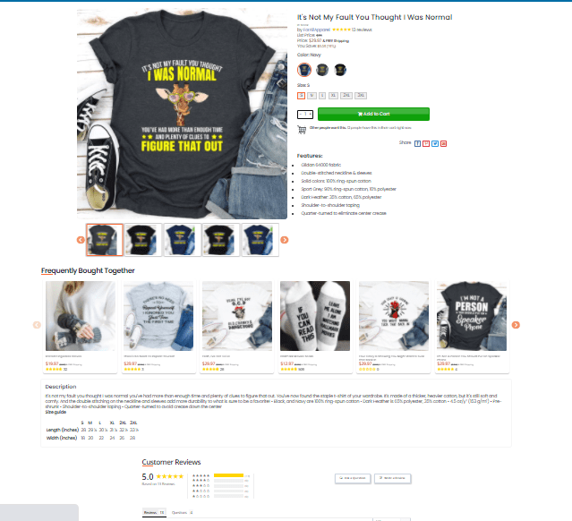
At the very least, your product landing page should have a strong description, high-resolution images or a video, and a simple checkout process.
Beautiful, sleek, and informative product landing pages should be a significant part of your store’s aesthetics.
The store should have numerous close-up images of various product angles and a model-wearing product (Shows product in use), all arranged in a user-friendly layout.
The product page should include a store’s Instagram feed, an explanation of the materials used, a diagram depicting the shoe’s structure, some key advantages, and customer comments.
Product listing page
A product page (also known as a collection site) lists various products in the store.
Each product should be displayed with images, the title, description, and price.
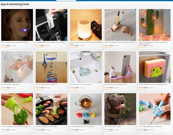
A product’s rating, availability, and other features could all be included in each product.
A product listing page is where the customer discovers everything a store has to offer. Typically, it displays all of the products or categories also known as collections available.
A product page’s anatomy
Check off the following eight items on your product page:
- The description should include all relevant product information, such as the name, price, and options for customization or variants (such as colors and sizes).
- A product description highlights the product’s features and how it fulfills the visitor’s needs, desires, or problems.
- A high-quality large photo of the product, such as a “featured image.”
- The images should be as relevant and actionable as possible. The user can click through additional pictures to get a better visual sense of the product’s size, texture, and use.
- Prominently highlighted call-to-action (CTA) button for the customer to add the product to their cart or pay right now.
- The product images are typically shown on the left side of the screen, and the product details and buy button are on the right.
- Use social proof such as product reviews, product testimonials, or trust badges to build confidence in your brand and items.
- It would help if you used your product recommendations to cross-sell and raise the visitor’s order total.
Time for an anatomy lesson to demonstrate how they function.
We’ll look at a Shopify product page for a skincare store called Bliss.
Unique product name.
The product’s name, “In the Honey,” is large and easy to read, and it’s written in the company’s branded typeface.
Underneath is a short description of what it is and for “Mega Moisturizing Lavender Honey Mask.”
Social proof On Product Page
Not just favicons, logos, and screenshots are necessary to display on your product page. It’s also critical to have social proof.
We have seen the difference it makes. You want people who see your customer reviews or product ratings to see that many use your products.
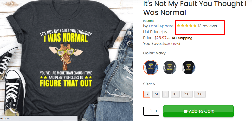
When you think about the number of products out there, you can see how important it is for your customers to see a social proof on the product page.
Product reviews allow consumers to learn from other users’ experiences, increasing their desire to buy.t.
Testimonials from actual customers may persuade them to buy your items. When consumers click this section, they are taken to the bottom of the page, where all Shopify’s product evaluations are displayed.
Product description:
A product description is a written account of various aspects of a particular product.
The product description is an important factor when it comes to selling the product as it helps people decide whether they want to buy or look at your product or not.

The product description includes information such as its availability, quality, features, etc., which helps people decide.
Writing a high converting product description is important to boost your sales and attract more customers.
Product descriptions include information about the availability, quality, features, and other essential information that people look for before buying.
The product description employs solid and colorful language to create a vivid picture of what the product delivers.
It’s an “extremely hydrating” mask that gives an “instant dose of moisture.” It “relieves and soothes super parched or irritated skin,” leaving it “dewy and baby-smooth.”
Bliss also includes vital information, such as its hypoallergenic and dermatologist-approved nature, the fact that it’s made for normal to dry skin, and is available in a 1.7-ounce container.
There’s no question who this product is designed for (someone with dry skin) or how it can assist them in resolving their issue (moisturize, hydrate, and soften it).
Set Product Price, quantity, and buy button:
Setting up product prices and allowing customers to choose product quantity and color is essential when setting up your eCommerce Store.
Setting up the right Call to action buy button that converts into sales is less than a science.

However, it can be challenging for new entrepreneurs because many factors affect the product’s final cost, such as weight and size.
They have to consider shipping costs and taxes; therefore, it requires extensive market research or consulting experts in this field who are well versed with the latest eCommerce trends or dropshipping business in general.
The price is simple to comprehend. The quantity selector is immediately below the price, so customers may choose how many they want.
Then straight to the “Add to Cart” button, which is colored yellow to stand out from the other goods on the page.
Yellow is also an attention-getting hue, according to color psychology. Yellow is linked with emotions such as happiness, optimism, and positivity. Later in this chapter, we’ll look at color psychology in further depth.
A simple and effective way to create a call to action buy button is by adding a Buy Now or Add to cart button.
Having the right pricing strategy, knowing exactly how your target audience will react and behave, and having a clear path of where they will go next are very important before you start selling online. Usually, people’s buying decisions are based on a combination of factors: Product price, Product availability, Product quality, and brand reputation.
With the help of eCommerce platforms such as Shopify, it is straightforward to create a store to sell your products.
To set up your product pricing, you will need to go to your Shopify Admin section and click on the “Products” tab.
From there, you will search for the product you want to sell and edit its details.
The next option is Product Pricing. You can choose per unit price or set up a range of prices for quantity discounts.
When you have an item in your Oberlo Shop, the product’s price is by default set to $0. You can change this price at any time – it’s a straightforward process!
To Set Product Pricing in your Shopify Dropshipping Store:
1. In the Oberlo app, find the product you want to change the price of and click the ‘Edit button.
2. At the top of the product page, you’ll find a ‘Selling Price section.’ This is where you can change your selling price for this specific product. Set the selling price to whatever you want!
3. When you’re done changing your price, scroll down and tap the ‘Save Product’ button.
That’s it! Your product has its new price and will be updated on your Shopify store.
If you want to change the price of a product that’s already been added to your store:
1. First, find the product in your Shopify store and click the ‘Edit button.
2. At the top of the product page, you’ll find a ‘Selling Price section.’ Set your selling price to whatever you want!
3. When you’re done changing your price, scroll down and tap the ‘Save Product’ button.
That’s it! Your product has its new price and will be updated on your Shop.
A well-researched product with an excellent selling price will attract your target audience. Just remember that all your work up to this point, from keyword research to competitor analysis, was so you could sell more at higher prices!
Product Featured image
When setting a featured image for a particular product, you can either upload the picture or choose one of your pictures that you have already uploaded to your media library.
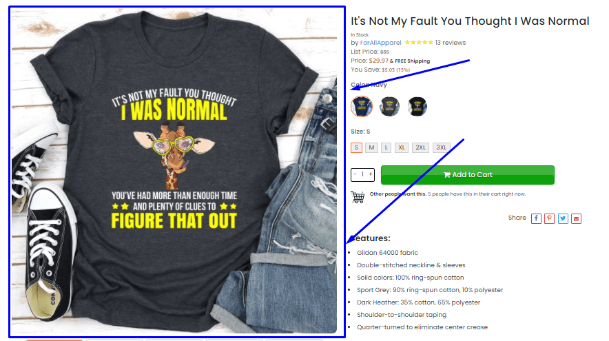
To set this setting, follow the below instructions:
1. Browse through the product in which you want to make setting changes.
2. Click on the product images setting, located at the right side of the screen underneath ‘Description.’
3. Here, you will see two setting options, “Use product image” and “Use Shopify Image.”
4. If you select the setting option “Use Shopify Image,” your store theme’s banner setting will be used.
5. If you select the setting option “Use product image,” then your uploaded Image setting will be used.
6. You can also update the settings of individual pictures by clicking on the picture of that particular setting and then choosing either of the two setting options mentioned above.
7. Click on save changes to make setting changes permanent.
The product image on Bliss shows the jar while supporting product pictures allow visitors to see what the texture looks like both inside and out of the jar and how it appears on someone’s face.
It’s crucial for a beauty product, especially since consumers want to know when they will apply it all over their bodies.
Supporting images and videos
Crucial in the Product Page of your store. Product Image is one thing, but Product Video is another; it will help you convince the customer to buy the product, seeing how it works or how it was made, etc.
Adding a Product Video to the product, a page will provide customers with more information regarding the product.

So let’s look at what are the benefits Product Video will add to your Product Page.
Benefits Product video adds in Product pages
1) Product Video Will Help customers get more information on the Product (What can you do with it, How it is made, What are its features etc.) hence increasing the product’s sales by making them buy it immediately.
2) Product Video will help customers become more familiar with your product, also allows customers to see how it can be used.
3) Product Video Product gives an engaging experience for the customers, and hence they stay on the Product Page longer, making them buy the product.
4) Product Videos helps in giving a live demo of Product
5) Multi-product Comparison: It’s not easy for one to see all features in the same brand of products. So a video Showcases the different features of your products.
6) Customers will get to know about your other Products: When customers are on the product page, they might also be interested, so it helps you increase the number of visitors to your other products in the same store.
Product Video in Product Page will do a lot of good for your business, so go ahead and add It.
For example
When you scroll “below the fold,” you get a closer look at the product in action, as well as a short 10-second Bliss YouTube product video that displays the model applying the mask and having fun.
It’s a collection of products images stitched together, making it another proof that product videos don’t have to be high-budget productions to achieve their goal and boost your brand’s appeal.
Additional product details
Additional product details are what you want your customer to know about your products before they buy them.
Additional product details are typically an essential piece of information that isn’t covered in the main details of the product. However, it’s still significant enough to be included in the description.
Online shopping sites need to include Additional product details on your product page.
For example
Underneath that, you’ll discover additional product information such as the components, allergens, and irritants it is free of, as well as how to use it.
Bliss’s “Blissfully free of” slogan makes a significant move. In today’s skincare climate, where words such as “parabens” and “sulfates” are expected, a vast audience of customers is familiar with them.
People avoid these by-products because they don’t want to be exposed to them. As a result, this region is a refuge for the appropriate visitors.
Bliss is an excellent example that Additional product details are essential for online shopping sites.
Additional product details give customers information that they need to know before they can buy the products.
Customers will be sure that the products they’re buying are not harmful to their health, and they will be sure that the Additional product details of the products they’re buying are correct.
Product recommendations are
Stores having product recommendations have a much higher conversion rate than those without product recommendations.

Product recommendations significantly increase sales and profits for companies, so it is vital to have them on your eCommerce website.
As the name suggests, it provides Product recommendations for products. It can increase user engagement by delivering contextual information surrounding Products.
For example
The “Perfect Pairings” section is a goldmine for cross-selling possibilities. The goal here is to grow your average order value (AOV), the average dollar value of each customer’s purchase.
One of the simplest methods to improve your AOV is to suggest best-selling related items.
Take a look at Shopify’s cross-selling apps, such as.
Frequently Bought Together, Personalizer by LimeSpot, and Bold Upsell.
Customer reviews on product pages are
Common practice tells customers how other people who used the product feel about it. As customer reviews can be one of your most helpful customer acquisition channels, they need to be included in each page with your products – especially when you want sales or feedbacks from potential customers. You will never know if a customer will buy the product they are viewing unless they have customer reviews.
Proper customer reviews in product pages can improve customer acquisition and help you generate more sales with just a few clicks of the mouse button.
Most customer acquisition channels are costly, but customer reviews do not cost anything to put up on your product pages.
Most Shopify store owners have customer reviews on their product page.
For example
Bliss also allows users to add personal information such as their location, skincare expertise and habits, skin type, gender, and age range. This provides individuals more insight into whether or not the product review is relevant to their traits and lifestyle – which helps to address one of the most widespread problems with beauty product reviews.
Extra credit tips
Apart from what we’ve discussed, a few more product page strategies can help you increase sales and enhance client loyalty.
Ensure that visitors feel compelled to act quickly or are worried about missing out on something. (Creating Sense Of Urgency).
This strategy is beneficial when you have a limited amount of products available. Create an air of exclusivity to create demand for your product (s).
Everyone wants to feel like they’re part of something exclusive. Create a sense of scarcity surrounding limited-edition products or special offers that only last for a short while.
Create an opportunity for social sharing to give your users the exposure they need to get the word out about their purchase, which will add to the urgency of purchasing.
Talk about how people are already buying, and specify how many people have purchased or shared since your product was added to your store. Create a feeling that time is running out. Your prospects don’t want it to getaway!
Create scarcity by indicating a limited quantity for this offer (or on this product).
Create urgency by suggesting that customers need to take action now if they want to secure the deal.
Impulse purchases are more likely to occur when your visitors feel excited, urgent or in some way influenced to purchase on their own accord.
This means you have got them interested in buying what you’re selling, rather than being sold to. Create a sense of urgency by pointing out that these products are in high demand or limited edition.
For example
A limit on time or inventory never hurts when it comes to encouraging impulse purchases. A Shopify product page can benefit from urgency and scarcity techniques by encouraging consumers to buy rather than think.
You may accomplish this in various ways, such as displaying which items are out of stock or unavailable. The fashion industry is ideal for it. You may also run flash sales and other limited-time offers.
Apps like these Shopify product page apps might assist:
Include an easy way to chat or message customer support
This is a crucial step to have a live support chat on your store because customers can ask questions about the product, additional products they would like to purchase, and even customer support agents can find out what problems customers are having with their purchase or website Facebook Messenger.
Customers who need help from your team will submit a lot more tickets than those who can solve their problems or questions independently. As stated before, having live support chat will increase the number of tickets submitted by your customers because they can instantly get an answer to their question instead of waiting for someone to answer it via email or Facebook Messenger.
This will allow you to communicate with your customers much more efficiently since the tickets will be submitted through your live support chat, and you can answer them in real-time.
Customer service is critical. Every page may have a chat option displayed at the bottom right corner, which demonstrates credibility and trustworthiness and helps you gain credibility and perceived reliability.
We can see a popup chat option at the bottom right corner of every Bliss page.
It indicates whether any customer service representatives are available to talk right now and gives people the option to chat with a representative.
Using advanced Shopify product page apps is the easiest way to implement this strategy. The Bliss example demonstrates how simple it is to search for customer service-related app in the Shopify app store, install it, and activate it within minutes.
3. Use color psychology to engage your target audience Use
The idea that different hues might elicit distinct emotions or sentiments is known as color psychology. Color psychology isn’t restricted to product pages; it should also be used in your company’s overall branding.
The following are some of the most important colors and the meanings attributed to them by color psychology.
It’s also crucial to think about your audience’s specific tastes. For example, one research on gender and color revealed that males like shaded hues (colors with black added), while females prefer tinged colors (colors with white added).
According to the researchers, color schemes with tints are soft, soothing, and young, while a scheme with hues is powerful, strange, and profound.
None of these hypotheses will be correct 100% of the time – there will always be exceptions and outliers based on your company and audience. However, color psychological theories can help you reconcile your creativity with the modern world’s fixation on emotional triggers for marketing purposes.
Three reasons why you should use color psychology in your product marketing:
– Highlight different features or product benefits by matching them with specific colors.
– Set the right tone for your product page.
– Increase conversions by speaking to the emotions of your target audience, not just their minds.
Three color psychology theories you should know:
1. Color can elicit specific emotions or sentiments in people, known as the emotion hypothesis.
Research has found that different hues may result in distinct emotional responses, although there can be differences in how different genders or cultures react to colors.
2. Colors represent specific words – this is known as the iconography hypothesis. There are associations between colors and particular objects based on widespread usage. An example would be that red represents stop signs.
3. The memory hypothesis states that people will associate specific colors with memories. For example, people will probably have positive memories of springtime if they usually see green grass along the ground during that time.
The following are some examples for inspiration:
– Studies have shown that men prefer darker schemes with black added while women prefer lighter schemes with white added. However, this may not be true in all cases. When considering color schemes, you need to be aware of your target audience’s preferences and tastes.
– Green is often used in company logos because trees are associated with life, shade, fertility, peace, harmony, freshness, ecology, etc.
– Websites for children will typically have bright colors, while websites for adults will have more subdued colors.
– Dark blue is known to represent trust, while orange represents enthusiasm.
– If you’re selling children’s toys, bright colors like red, yellow, and purple will be best; if you’re selling women’s fashion accessories, pastels are better; if you’re selling office supplies or technology gadgets, then darker hues are more suitable.
– Visitors will be more likely to click on a colorful banner ad than one in black and white.
– Use suitable color schemes in your company’s branding, not just in product pages or advertisements.
You now know what a product page is, which components make one practical, and which Shopify product page apps may assist you with your store. Then let’s get more technical and see how to create great product descriptions for your Shopify product pages.



Comments (0)