If you’re operating a Shopify store, you’ve certainly encountered a chargeback; if…
11 Color Psychology : Impact of Color Theme on Store
Colors have a profound bearing on how people view your brand. Whether you’re a fashion brand looking to connect with a younger audience or a medical supplies store looking to build customer trust, you can use color meanings to help you better attract and connect with your customer base.
You may leverage color psychology to assist in the development of a powerful, relatable brand. We’ll define color psychology in this article and enlighten you on the color meanings of the most often used colors.
Defining the Color Psychology
Color Psychology
Color psychology is the examination of the relationship between colors and human behavior. It seeks to ascertain how color influences our daily decisions, such as which goods to purchase.
Is the color of a woman’s dress enough to entice us to buy it? Do we prefer one brand over another based on the color of the package?
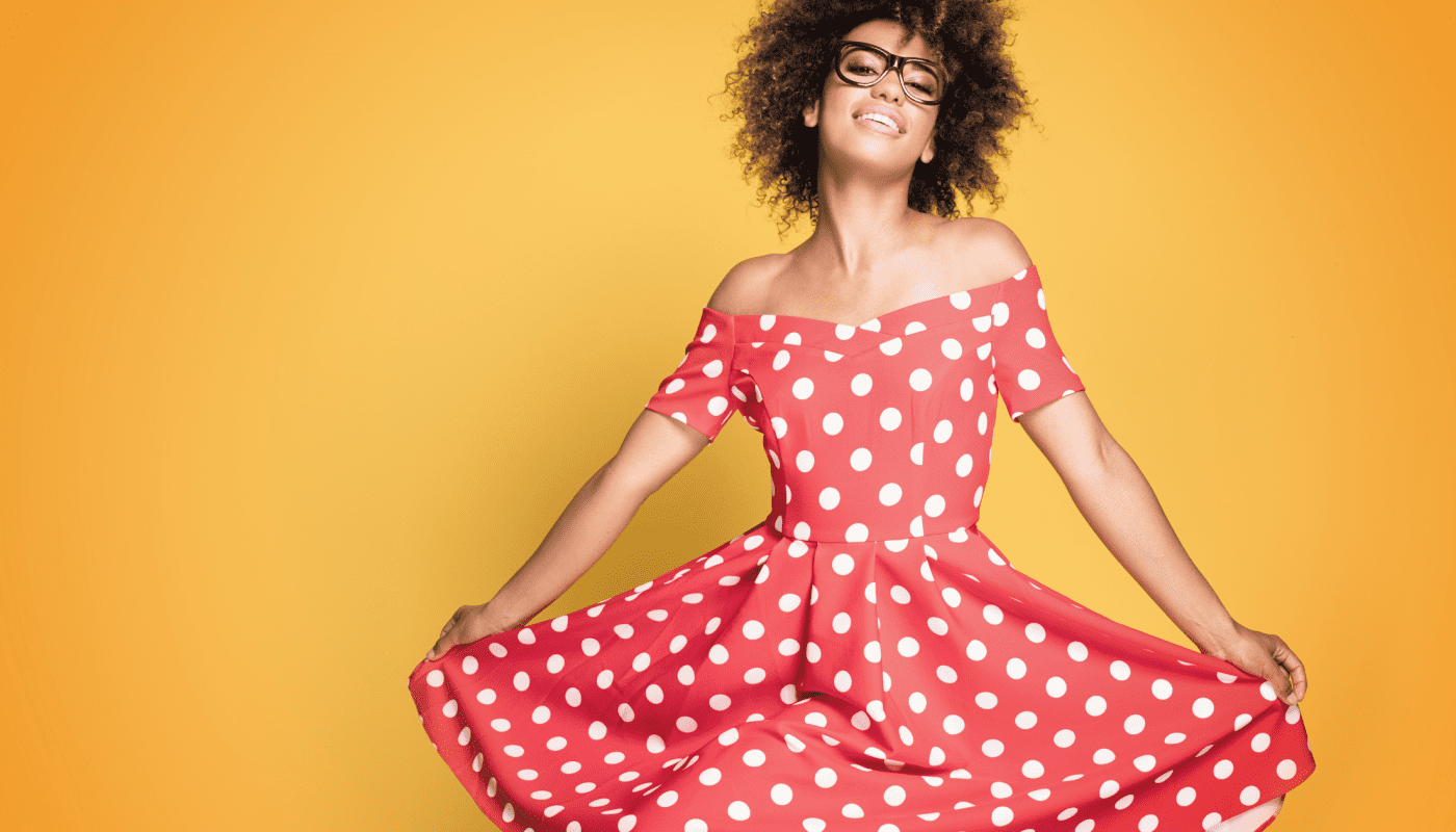
Is it true that the color of an icon increases our likelihood of clicking on it? In a nutshell, sure. However, the why is a bit more complicated.
Color meanings can influence our preferences for particular colors over others. The same color can have multiple interpretations depending on our upbringing, gender, location, values, and other factors.
How Does Color Psychology Get Used in Marketing?
Colored objects elicit an emotional response. It elicits feelings. And this case is true when it comes to choosing colors for your business.
Choosing the appropriate colors for your marketing efforts can mean the difference between your brand standing out and blending in with the crowd.

By strategically utilizing colors in your marketing efforts, you can direct your audience’s attention to the information you want them to see and help them perceive you in the manner you wish to be perceived.
Having a firm grasp of color psychology can be highly beneficial to your marketing efforts because it enables you to portray your brand in the way you wish.
While the right colors can help your brand be perceived more positively, a poor color selection can work against your brand image.
For example, if you choose the wrong colors for your content or logo, it may become less readable and difficult to understand by your audience.
Or you can risk being completely ignored.
Marketers can use color to influence how people think and behave toward a brand and how they Interpret information.
Colors can help people in determining what is critical. That is why content marketers must understand the meaning of different colors.
The Interpretations of Colors
Orange Color Psychology
Orange is the color of creativity, adventure, zeal, success, and balance in color psychology. Orange injects a sense of playfulness into any color, website, or marketing material it appears on.
Despite its attractive hue, it lacks the commanding presence of red. Many marketers continue to use color to highlight calls to actions or areas of a website they wish to draw the viewer’s attention to.
Colors at The Home Depot
Orange’s symbolic meaning is evident in logos such as those for Nickelodeon and The Home Depot.

Nickelodeon is a children’s channel, and thus the logo’s playful orange color accurately represents the creativity and enthusiasm required for a children’s show.
The Home Depot sells a variety of products for use around the house.

Many do-it-yourselfers (DIYers) visit Home Depot to purchase products to renovate or adjust their homes. Additionally, the orange logo represents creativity in this instance.
One of the most popular orange color psychology myths is that people with an orange personality will make you angry.
Some say that there is a connection between color and attitudes such as anger, aggression, and arrogance.
This is not true.
The personality of someone with an orange personality can be likable and cheerful without having to be aggressive or arrogant.
Orange personalities are known for being sensitive in their interpersonal relationships. They can also be outgoing and lively without having to be angry or aggressive.
Orange colors in clothing also don’t always convey a strong personality either. Even though many see it as attention-grabbing, some might wear it when they want an easier time blending in with the crowd.
The meaning of orange is most closely associated with fun, happiness, and health. It’s also related to optimism and energy. This color can be both playful and warm at the same time.
Brown Color Psychology
Brown is a warm, earthy hue. After all, soil, wood, and stone are all shades of brown. As a result, color psychology demonstrates that brown is associated with comfort, security, and down-to-earth nature.
Brown is often used for food-related and natural product advertisements.
Because of its contrast against a white background, brown appears in logos, banner pictures, and occasionally text.
UPS is an example of a brand that leverages the symbolic implications of color in its branding.
The brown of their logo is highlighted in their website’s navigation and drop-down menus. Additionally, you may observe that complementary colors such as yellow and green all contain natural elements.

For instance, yellow may symbolize the sun, whereas green may symbolize nature.
Taken together, it helps establish UPS as a safe, dependable, and down-to-earth firm, which is precisely what you want from a delivery service.
Yellow Color Psychology
Yellow has a strong association with sunshine in color psychology. It conjures up images of happiness, positivity, optimism, and summer, but also of deception and foreboding.
Certain brands opt for a bright yellow background or border for their website design.
You can also use yellow for your website’s top-level ‘free shipping’ bar if it complements the rest of the design.
A dash of yellow can assist your website visitors in associating your store with something positive.
The meaning of yellow depends on the shade of yellow we are talking about.
Pale yellow reminds us of the sun and is a symbol of energy. However, if we talk about yellow as a sign of cowardice or betrayal, then it might be worth looking further into what happened to the person who reacted that way in your presence.
Ikea-color psychology
Ferrari and Ikea, for example, both use the color yellow. Numerous people aspire to drive a Ferrari. The luxury brand is synonymous with this sense of well-being, summer, and a carefree way of happiness.
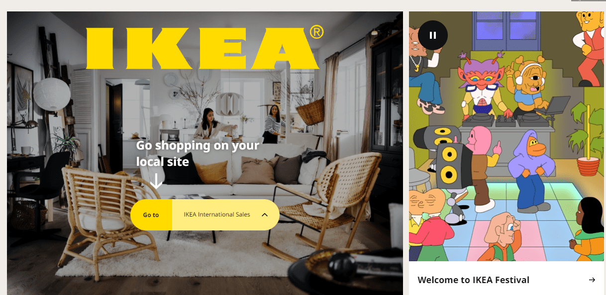
Ikea’s branding also incorporates the yellowing color. What connection does purchasing furniture have to happiness? Now, let’s consider who is most likely to purchase those products.
Many people who have recently purchased their first home or are moving out for the first time will visit Ikea to buy furnishings for their new space.
Yellow is an excellent color to associate with this milestone because it is typically filled with happiness and optimism for the new change.
Purple Color Psychology
Purple is deemed a royal color in color psychology. Purple is associated with power, grandeur, elegance, knowledge, and spirituality. However, resist overusing the color, as it may elicit feelings of dissatisfaction.
Some view its excessive use as arrogant. Purple can incorporate your website’s design in various ways, including the free shipping bar, your logo, & as an accent color in your graphics.
The color purple relates to nobility and royalty as well as creativity and wisdom. If you are in the company of someone who wants to be treated like royalty, purple is probably her favorite color.
Hallmark-a color that denotes purple
Purple is a color that is used by companies such as Hallmark and Yahoo. When you browse both websites, you’ll see purple is used as an accent color.
Hallmark’s logo and top navigation are purple, but the rest of the website is designed in a range of other colors.
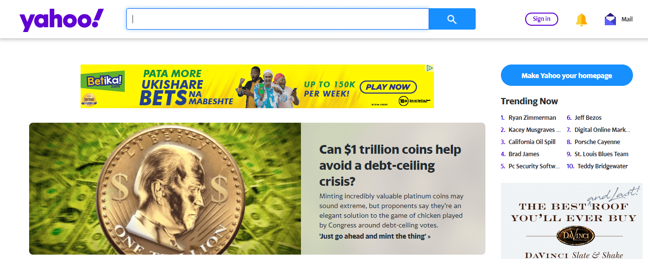
Purple is used in Yahoo’s logo, top navigation words, and Yahoo icons such as Mail.
Green Color Psychology
Green has a strong association with nature and money in color psychology. The color is associated with growth, fertility, health, and generosity. Green also carries some negative connotations, such as envy.
If your online store is in the health or fitness niche, you may want to add more green elements. For instance, the background of your homepage banner image or logo could be green.
In some way, green is the most natural color of all colors. We find plenty of green in nature.
That’s why green is about harmony, freshness, and health too. Green also means hope in many countries. This color makes people think of springtime and the trees growing leaves again.
John Deere-marketing colors
John Deere and Roots have popularized the use of green. John Deere’s entire brand is built around the concept of nature. Their product line is comprised of landscaping, agriculture, and lawn care equipment.

Their branding is so ingrained in green that even their equipment is the same shade of green as their logo.
That way, anyone who sees that product will immediately recognize it like a John Deere. The root is a retailer of fashion.
However, if you browse their banner images and marketing materials, you’ll notice that their models are frequently photographed in natural outdoor settings.
The green logo complements their natural imagery, which helps them reach out to outdoor enthusiasts as a target market.
Thus, even if your products are not necessarily niche-related, you can use color to target a specific demographic.
White Color Psychology
White is associated with purity, goodness, cleanliness, and humility in color psychology. Bear in mind that this is the cultural connotation in North America. White has the opposite connotation in some places of the world.
You’ll want to keep this in mind depending on your target demographic. White’s color meaning also has a negative connotation since it represents sterility and cold. White is the most often used color on eCommerce websites.
You’re almost certainly going to use it as the background color for your product photograph.
Your pages will most likely be white with black font. It’s because the black text on a white background is the most readable color combination.
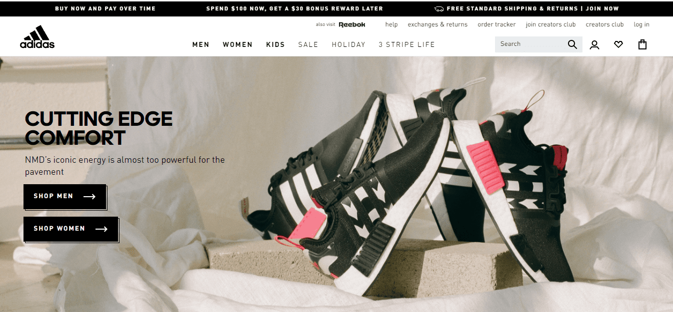
ASOS and Adidas sell their products in white. The words in the header, logo, & background of ASOS are all white.
If the background is grey or black, the font is white; when it is white, it is black.
The top navigation on Adidas’ online store is black. The usage of a white logo aids contrast. Because their background is white, they chose grey for product photos to bring another tone to the mix.
Numerous manufacturers that use white as a primary color frequently match it with black or grey.
The meaning of white varies widely depending on the context in which it is used. It can be associated with goodness, innocence, and purity, as well as sterility and death.
For example, white wedding dresses are associated with virginity here. However, if you were looking at a black wedding dress, that would be a sign of widowhood
Black Color Psychology
In the retail industry, black is a popular color. Black’s color meaning is suggestive of mystery, strength, elegance, and refinement in color psychology.
By contrast, color meanings can elicit strong emotions such as grief or rage.
Numerous fashion retailers have included the color black in their logos. Black is also a standard text color since it is simple to read.
Certain firms choose black and white graphics for lifestyle banners or icons to establish a specific tone or uniformity throughout their website.
The color black relates to power, sophistication, formality, and death. It’s important to remember that people will probably view you as mighty if you dress in black for an interview or other formal event.
However, usage of black can also mean evilness and violence, so most uniforms are colored black.
Chanel-color psychology
Black is a color that is popular with shops such as Chanel and Nike. Chanel’s logo is black, and its website features various black and white photos to maintain a consistent aesthetic.
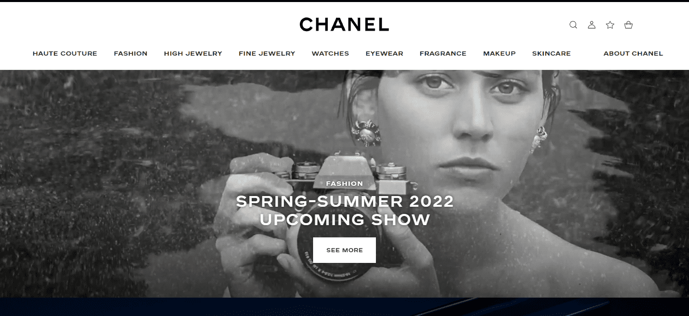
When you first visit their website, you’re greeted by a thick black top navigation background.
They employ a black font for both their graphics and text. Notably, their call to action is likewise written in black.
Numerous businesses, particularly those in the fashion segment, use black calls to stand out against a white background.
Nike’s website, meanwhile, is colored in black, white, and grey. Their logo and font are all in black on their website.
As a result, the website’s content is easily readable. As with Chanel, their call to action is black, which adds visual attention to the item you’re adding to your ‘bag’ (cart).
Pink Color Psychology
Pink is a popular color choice for brands that cater primarily to female customers. Pink is associated with femininity, playfulness, immaturity, and unconditional love, according to color psychology.
Certain brands have chosen pink for their product packaging, particularly for girls’ toys.
Other brands use the pink color prominently in their logo, website design or emphasize critical messages.
The meaning of pink is purely subjective and often depends on the individual. That said, most people associate pink with love and romance as well as kindness towards children.
However, it can also mean weakness and innocence, especially if we think about a baby girl dressed in a homemade pink dress for a family photo.
Kylie Jenner of kylie cosmetics utilizes pink in her store.
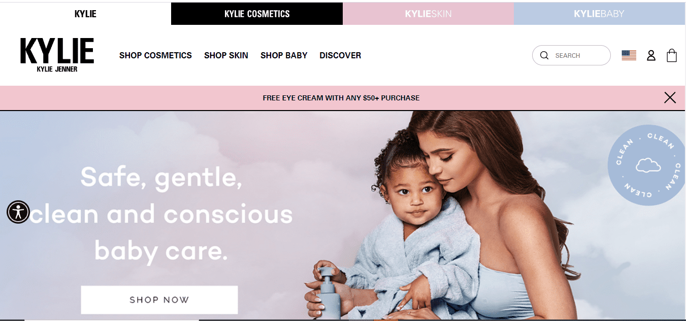
Given that Pink’s color meaning connotes femininity, it’s unsurprising that brands like Victoria’s Secret and Barbie make extensive use of the color. Victoria’s Secret has even given one of its brands the name Pink.
They use a combination of pink and black to emphasize key marketing details on their website. Pink is also used in their logo and particular marketing messages.
CTAs are highlighted in bright Pink on Barbie’s website. Additionally, color is used subtly in their top navigation and drop-down menu.
And, of course, their product packaging and logo reinforce their brand’s feminine pink hue.
Blue Color Psychology
Blue has a strong association with the sea and the sky in color psychology.
Stability, harmony, peace, calm, and trust are just a few of the emotions your customers may experience when your brand incorporates the color blue.
Blue as a color can at times have negative connotations, I.e a depression, and it may evoke cold feelings.
Blue is used in the logo of your website or the top navigation of your website.
Some retailers use blue to highlight their guarantee, trust certification, or free shipping icons, reinforcing the color’s reputation for trust.
Blue stands for trust, security, and confidence. Blue conveys a sense of calmness. It makes people think about rest, serenity, and peace too.
The blue creates a soothing effect on us because it reminds us of water.
There are few things as peaceful as a lovely quiet lake or the ocean. In addition to being associated with calmness, blue is often related to sadness.
Blue can also mean stability and reliability as well as conservative behavior.
Oral B-color meanings
Blue is widely used in the marketing of technology brands such as Facebook, Twitter, and Skype. However, retailers such as Walmart and Oral B use color as well.
The blue in the Walmart logo can help establish the brand as reliable, trustworthy, and relaxing.
After all, Walmart is a convenience store where you can purchase groceries and do other shopping in one convenient location.
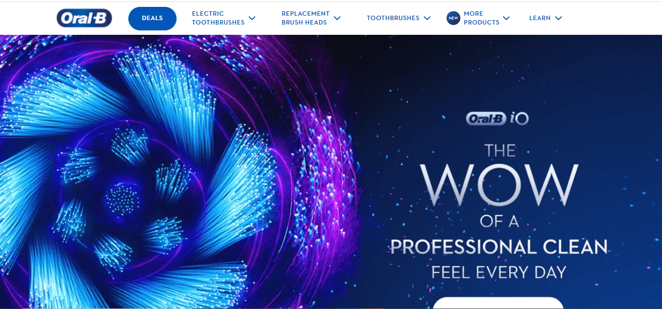
Oral B is a brand of dental health products that sells toothbrushes. Healthcare niches, such as Oral B, frequently use blue in their branding to help consumers connect the brand with a high-quality, reliable, and safe product.
Red Color Psychology
Red is an excellent example of a marketing color that can grab attention. The red color is symbolic of excitement, passion, danger, vitality, and action. You may have noticed that some brands utilize red for their ‘order now’ buttons or packaging to help them stand out on the shelf.
Red is the most intense color according to color psychology. As a result, it is capable of eliciting the strongest emotions. Red can also evoke fear, so it’s best to use it sparingly.
If you must include the color red on your website, reserve it for call-to-action buttons or sale icons that contrast nicely with the design of your store.
Coca Cola-color psychology
Red is the brand-defining color for Coca-Cola and YouTube, among others. Red stimulates appetite, which is why brands such as Coca-Cola frequently use it in their branding.
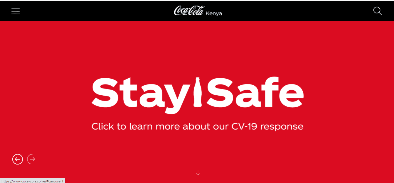
Additionally, they use the word “happiness” in their branding and use red to elicit excitement.
YouTube almost certainly uses the color red to convey the excitement associated with watching videos online.
Please note how the red portion of their logo represents the play button, which can help motivate someone to act. It compels you to click play on their videos.
The red color is one of the strongest and most striking colors. It can cause an emotional response like no other color does because it symbolizes love, danger, and passion.
It also represents aggression and excitement as well as values such as security.
The red makes people think about intercourse and sensuality too. This color stimulates us to take action. It is an excellent color for running paid advertising.
Grey Color Meaning
Grey is a color associated with neutrality and balance in color psychology.
Its color connotation is probably derived from the fact that it is a shade between white and black.
Grey, on the other hand, carries some negative associations, notably concerning depression and loss.
It is drab due to a lack of color. Grey can be utilized to enhance the appeal of fonts, headers, graphics, and even objects.
Apple is an example of a brand that incorporates the gray color into its branding.
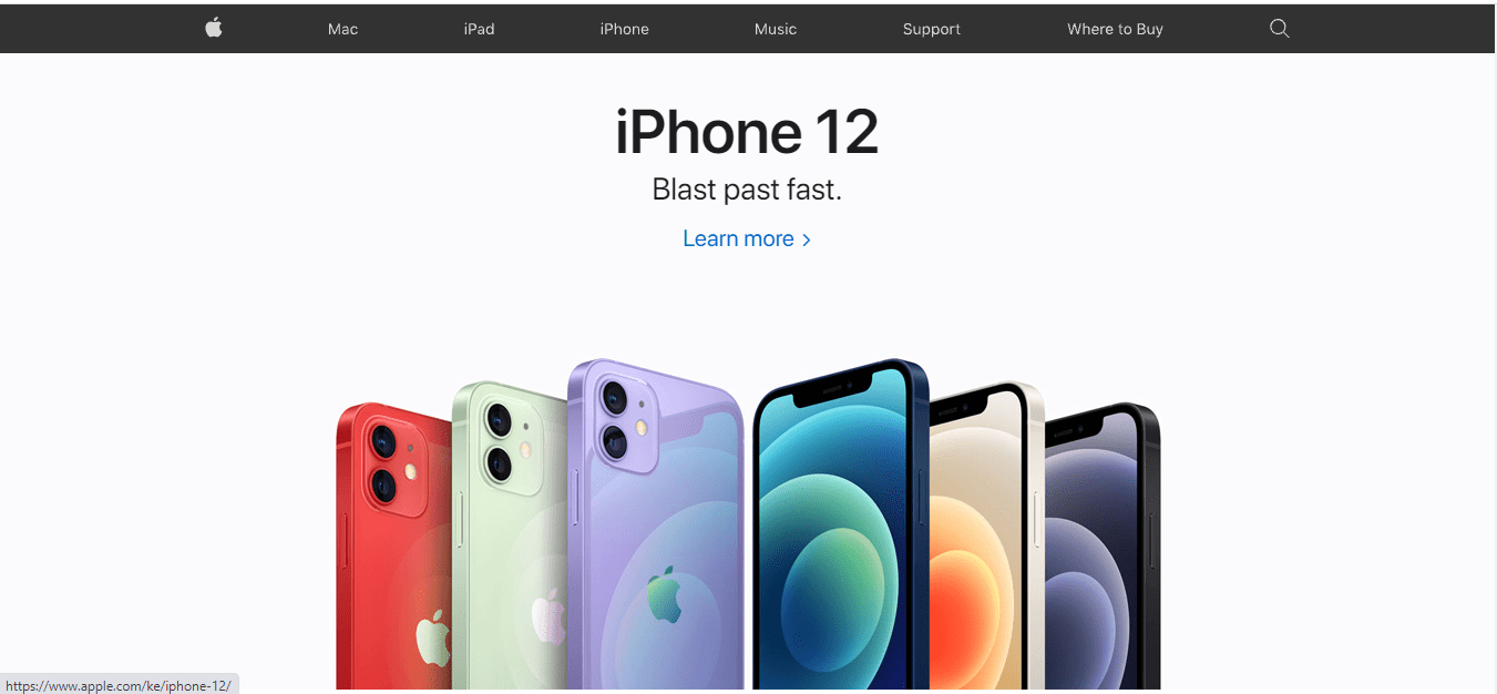
Besides, many of their computers are grey or silver, which is universally appealing.
On their website, they employ the color grey as a backdrop for a white logo.
However, you’ll see a consistent mix of white, black, and grey across their branding, which helps maintain a clean, neutral aesthetic.
Myths About the Color Psychology
Although color psychology has been studied and evaluated for many years, there is still considerable controversy about the precise effect of color on human psychology.
However, the question is, why are there so many misconceptions about color psychology and its meaning?
One of the reasons is that there are numerous elements at play regarding the psychology of color.
There is a possibility that various individuals will interpret colors differently.
How you view a particular color may be influenced by your personal preferences, prior experiences, cultural and gender variances, and so forth.
A study in 2005 by researchers at the University of Nevada, Reno, found that people who see themselves as extroverts are more likely to purchase red clothing than introverts.
The study also found that men were more likely to buy blue clothing, while women favored purple.
It’s important to note that these findings are just correlations and not necessarily cause-and-effect relationships.
However, it is believed that color plays a vital role in the psychology of marketing.
Color conveys all kinds of meanings and can trigger emotional responses. For example, red is stimulating and arousing, and blue is calm and serene – both qualities considered desirable by marketers.
Effect of color on consumer decisions
Color is the most influential factor in product branding as it sets a mood, creates a feeling, and reinforces a brand.
A study conducted by researchers at the University of British Columbia found that people saw different colors representing feelings such as trust, excitement, and sadness.
Thus, an effective way to influence a consumer’s buying decision is by making them feel a certain way and feel good about the brand.
Color conveys all kinds of meanings and can trigger emotional responses. For example, red is stimulating and arousing, and blue is calm and serene – both qualities considered desirable by marketers.
Thus, color plays a significant role in the consumer decision-making process as it provides context to brands and what they stand for.
Companies should understand that color must be used carefully as it can also elicit subconscious feelings and could backfire if not used correctly.
Consumers cannot always put their finger on how a specific color makes them feel, but these wrong emotions can ruin a brand entirely.
How do marketers use color to their advantage?
Marketers use color to convey the meaning of a brand. For example, Google uses blue because it is calming and trustworthy.
According to several researchers at the University of Lancaster, green is perceived as natural while red is exciting.
Therefore, green is a better color choice for a natural product, but a fast food outlet would use red.
Color is also associated with specific emotions – stay away from using colors that may have negative connotations not to hurt the brand’s image.
One company that has successfully influenced consumer decisions with color is Apple.
Apple uses the association of rose gold to communicate its brand messaging, which reflects innovation and luxury.
According to several studies in the Journal of Consumer Research and “The Journal of Retailing,” people prefer rare products and stand out from other brands.
Apple’s use of rose gold fits their brand messaging as it is different from the usual black or silver colors used by competitors.
It was so successful that Samsung, one of Apple’s competitors, released a product line in pink to differentiate themselves from other brands.
What’s the best color combination for an online store?
The color of a website has a significant impact on its visitors. It’s one of the most important factors when designing/redesigning a website or choosing colors for web banners and logos.
Colors can affect our emotions, moods, and behavior towards specific actions (e.g., clicking links).
Do you know what color combination is the best for an online store?
The answer is simple: it depends. Many believe that contrast is the key, and if you combine two contrasting colors, it will produce a more professional-looking website. In contrast, others claim that sticking to one color scheme throughout your website delivers the best results.
At Dropshippingit, we’ve tested this on some of our client websites, and we’ve seen that using contrasting colors can be effective when it comes to branding and standing out from competitors.
The reason why contrast works well is that it draws the user’s attention, leading them to take action (e.g., clicking on a banner). If you use similar color schemes throughout your website, the chance of losing your visitors is higher.
The following color schemes are proven to work well together: blue/orange, red/green, yellow/purple.
As for text colors, black font on a white background produces the best results because everyone can see it.
However, if you’re using dark backgrounds, light fonts should be used to produce high contrast.
What psychology says about colors?
People have many different color associations. Green is often seen as calming, purple is associated with royalty, black can represent mystery and sophistication, and orange represents excitement.
Even studies say blue relates to productivity because the color blue helps you feel more alert.
When deciding on a color scheme for an online store, it’s essential to consider what colors will work best for your products. Some colors may not sell as well as others or may be difficult to read. Before choosing a color scheme for your site, keep in mind these four things:
1. Some Colors Will Sell Better Than Others
Specific colors are proven to sell better than others. For example, some studies show that orange sells the best of all colors online. So if you’re selling food items or cosmetics, this may be the color for you.
Yellow also does well online because it’s known as a happy, carefree color. Red is another popular choice.
It’s known as a color of passion and gets people’s attention. Blue is another well-selling color because it creates feelings of trust, security, and stability.
2. The Site’s Readability Is Important, Too
Your site needs to be easy to read for your customers no matter what you’re selling or where they are in the world.
If you’re selling products traditionally associated with a particular color, your site’s color scheme should reflect that.
For example, if you sell motorcycles or accessories for them, black will work well because it represents power and strength.
3. Consider Your Target Market
Consider what age group you are marketing to when choosing colors for your site. If you want to sell to younger people, consider bright colors like pink or blue.
This can also be a good strategy if you target teens and tweens who are at the height of their fickle spending years.
4. Not all colors are created equal. If you run an online store that sells baby clothes, for example, it may be best to use bright “bold” colors on your site because parents will more likely buy colorful items for their children.
However, if you sell men’s fashion accessories, you’ll want to stick with classic neutrals because bright colors may not sell as well.
What is the strongest color psychologically?
Color psychology is a powerful field of study wherein colors have meanings and influences on people.
While colors have been mainly held to symbolic significance, a recent study by a team of researchers at the University of British Columbia suggests that color may influence our moods and behaviors in ways previously unsuspected.
The first experiment required participants to identify the gender of people depicted in photographs, either black and white or color.
Participants sorted images as quickly as possible, with sorting times being recorded by the researchers.
In this experiment, those who viewed individuals dressed in red made more errors than those looking at blue-dressed figures.
However, the researchers weren’t sure which aspect of redness was responsible for producing this effect.
Was it a specific shade?
A particular wavelength?
Were some people’s brains simply better at distinguishing between shades of red and blue, while others were not?
To explore this, they conducted a third experiment in which participants were asked to point out the center of a circle composed of eight surrounding circles.
Within each set of eight, one circle was red, and the others were blue.
The participants in this test didn’t make any errors in distinguishing the colors from each other. Their performance on this task suggested that it wasn’t a matter of color discrimination but rather an aspect of redness responsible for producing the earlier results.
What colors trigger what emotions?
Some people say that colors trigger different emotions. For example, they believe that people feel more relaxed when they wear green.
Others believe that the color blue triggers feelings of sadness or fear.
The truth is, there are few studies on colors and emotions. So, we can’t be sure how colors impact our moods. But one thing is for sure: you’ll feel better if you wear something colorful!
Some scientists say that lighter colors like yellow, red, and orange cause people to feel energetic. They think that darker colors like black, grey, and purple make people feel tired.
Other scientists say that the color blue triggers feelings of sadness or fear. People may feel peaceful when they wear green.
And orange can make people feel confident and happy. But there’s not much evidence to back these claims up.
The truth is, there are few studies on colors and emotions. You’ll feel better if you wear something colorful!
Conclusion
Brand color psychology-colors can communicate. What are the colors of your brand? How did you make your selections?
After learning about color psychology and the most popular color meanings for each color, it’s time to apply them to your business.
While many areas have established colors, such as blue for health care, you cannot follow them.
Consider selecting colors that reflect the essence of your brand or the emotions you want your customers to experience when browsing your online store.
If you the goal is to increase the conversion rates of your online store, it pays to understand how color psychology impacts people’s brain activity.
Studies have shown specific colors to evoke emotions and mental associations that affect our mood or perceptions of a product.
For example, red is associated with power, so using this vibrant hue on your homepage will stimulate feelings of excitement among visitors.
Yet blue has traditionally been linked with trustworthiness, so it may be best for landing pages where you are trying to get someone into an email list or sell them something expensive like insurance.
The key takeaway is that there isn’t just one “correct” answer when choosing what type of color scheme works best for your business–it depends on who you’re selling products to!
With that in mind, use the information above to help inform your color choices.
Want to learn more?
- Find Clothing Manufacturers For Your Business (2021)
- How To Build Powerful Product Pages That Converts In 2021
- 9 Niche Markets Examples For Finding Products To Sell (2021)
- How to Create Facebook Custom Audience In 2021
- Tips and Tricks To Making Dropshipping A Success in 2021
Business name algorithms will generate unique names that are guaranteed not to infringe on trademarks or copyrights while still being attractive enough to catch customers’ attention.
You’ll also save time by ensuring your new business name is usable everywhere and doesn’t require proofreading because it was generated from scratch with no errors!
Small Request
Kindly share it with your friends. Especially, the ones you believe really need this information.
Sharing this information with others can make a huge difference. You may ask why?
Well, the truth is, my main aim is to provide the best information pertaining to drop shipping for both beginners and experienced dropshippers.
And I plan to continue doing so for as long as I can.
I would also like to thank those who support the work I do through reading my content and sharing.
Trust me, when you take your time and share it will help a lot not only for me but also for other people who may really be in need of this information.
Here are some great suggestions:
- Pin it
- Share it on another blog
- Share on Facebook (Share it with friends and even on Facebook groups)
- Tweet it
- Stumble it
This will only take a few seconds of your time and I would really appreciate it.
I appreciate you a lot. Thank you!
Join my Shopify dropshipping group mastermind and follow my blog to learn more about Shopify tips, dropshipping guides, dropshipping tricks and checklists, and e-commerce in general.
If you enjoyed and learned something from this post, you can get updates from me, free of charge!
I send out email newsletters about new posts published on the blog, tips, and tricks to help you grow your dropshipping business, as well as new YouTube videos to give you more insights about the e-commerce market, and much more.
If you enjoyed reading this, you can as well join my Facebook group. Thank you for reading how to make money dropshipping online from the comfort of your home.
Click The Image To Join My Facebook Mastermind Group




Comments (0)