If you’re operating a Shopify store, you’ve certainly encountered a chargeback; if…
20 Of The Best Newsletter Examples To Copy
Compelling newsletter examples are interesting and useful and draw the reader in. This can mean bright colors and attention-catching photos, or it can mean keeping things simple so that the focus is on what’s most important.
The leading brands are always looking for new, relevant ideas for their marketing newsletters that aren’t just about sales or boring confirmation emails.

They always have their subscribers in mind. They provide real solutions to their members’ problems and pain points while entertaining and engaging them. All while building more trust and confidence in the brand.
This post is about:
- Newsletter templates and ideas for various purposes and events, such as welcome emails, company news, and content round-ups.
- Newsletter format hints for maximizing engagement with your layout, style, and visuals
- Examples of creative newsletters, as well as classic, traditional, and “safe” examples
- Insightful newsletter campaign examples from ecommerce and non-ecommerce businesses
Ecommerce Newsletter Examples
Let’s look at ten real Newsletter Examples that ecommerce brands have sent out.
Anthropologie
Anthropologie is a company for women’s clothes, accessories, and home decor known for its “bohemian” style, which is quirky and casual but still glamorous.
Because of this, visuals are a big part of the company’s identity.

This email is both promotional and informative. It tells customers about a 20% off sale and gives them tips on decorating their homes to help them decide what to buy. And they do all of this with the help of stunning product photography.
They also use fonts well to show personality while keeping them clean. Also, it’s one of the more naturally responsive newsletter examples because it employs a “mobile-first” layout that looks good on both a desktop and a mobile device. Win-win.
Tailor Brands
Online branding and marketing company Tailor Brands employs a traditional incentive to get subscribers to fill out a survey. (Because you sometimes have to pay people for that much-wanted feedback!)
This example of a newsletter is beautifully simple, and the contrast between the colors draws your attention to all the right places.
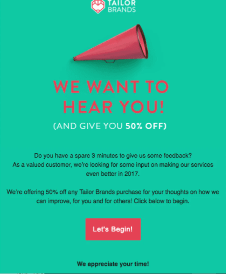
For example, the green background lets you use red and white for the main headline and subheadline while keeping the main body copy black. The clever use of color makes it one of the best Newsletter Examples headlines.
Also, the subject line is a fun twist on a well-known saying that makes readers wonder what else they’re hinting at.
The Hill-Side
This is a rare exception to the rule that your branding should always be the same. For example, Hill-Side, a company that makes men’s clothes, do something unique and smart to stand out on Cyber Monday, the most popular day of the year for online shopping.
So if you have an email account, you know Cyber Monday turns your inbox into a battleground.

This email is entirely out of character, with a tech theme that reminds me of a hacker. Or get in touch with your inner computer nerd from the late 1990s.
Or a hacker from the 1990s. In any case, it captures the idea of “cyber” while surprising you (and hopefully making you smile).
This is, without a doubt, one of the most creative Newsletter Examples design you can find.
Casper Labs
Casper Labs is the research arm of Casper, a company that makes high-quality mattresses. This dedicated product email introduced a new company idea, with the interesting bit being grace and poise. They use a problem-solution structure and simple stories to show how they solved a problem.
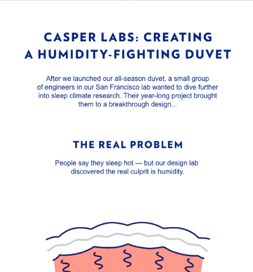
Simple graphics improve the Newsletter’s story format and help reinforce the company’s brand. For example, instead of a hard sell, the “Learn more” CTA button (along with the play button in the header GIF) takes the reader to Casper’s Kickstarter page, where they can help fund the development and production of the new duvet.
They also used a URL that could be tracked so that they could see how many people went to Kickstarter because of the email.
Bombas
Bombas, a company that makes socks, has perfected the referral email. The email’s header, one of the clearest Newsletter Examples headlines, says, “Refer a friend, get free socks.” It’s as simple as that.
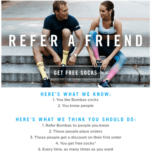
Instead of using blurbs or big blocks of text to explain how everything works, they use short, numbered lists. The blue subtitles make a clear difference, and visual separation leads to the bright pink “Refer a friend…” button. So that the main call to action doesn’t get lost, the “Get free…” button in the header image leads to the same link (call-to-action).
All while keeping the stylish and engaging spirit of the brand.
Read Also:
- 16 Best Email Marketing Tools For Small Businesses (2023)
- 18 Killer Email Marketing Examples In 2022
- The 11 Email Marketing KPIs And Metrics That Matters (2022)
- The Basic Email Marketing Strategy For Shopify Store (A-Z)
- How To Engage People With Email Marketing For Shopify (2022)
- How To Engage People With Email Marketing For Shopify (2022)
Peloton
Peloton is a company that makes indoor exercise bikes that show live cycling classes on the screen on the bike. In this case, the Newsletter is short and simple to put together. Instead, it employs a short, action-oriented copy, and there is just one call to action: get the bike.
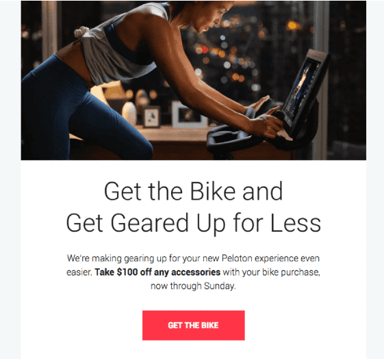
The bright “Limited…offer” banner and “Get the bike” button stand out from the black-and-white design of the rest of the email to encourage people to do so. This gets your attention right away on the most important things.
They also did an excellent job with the “lifestyle photo,” which is one of the best tips for product photography. It shows the product in action and makes it easy for the reader to imagine using it at home.
Soylent
If you want to send an email to get people excited about an upcoming announcement, ensure it gets done. Doing it could strengthen your campaign and make it look like spam. But this is an example of a newsletter teaser that works well to get the reader interested.
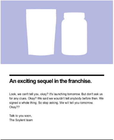
Soylent, a company that makes products to replace meals, sends a clean and simple teaser for a new mystery product in their line. The tone is casual, relatable, & self-aware, which draws the reader in and may make them laugh.
Harry’s
You can push your products only sometimes, and you shouldn’t. In this example newsletter, Harry’s, a company that sells shaving and grooming products for men, sends out an instructional and educational email related to its business.
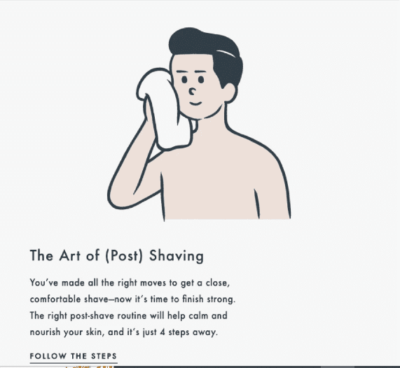
Unfortunately, Harry’s doesn’t just sell products; it teaches customers how to take better care of their skin and get more out of shaving.
All of this is done in a newsletter format that is clean, simple, and appreciates white space. They use the brand’s signature brand font, which is simple to read and understand while still standing out and reinforcing Harry’s brand.
Toms
Toms, a shoe company, has a product newsletter that shows how it can be used. They’re using a seasonal approach and a creative email newsletter image format in creating their everyday brand relevant to Halloween.
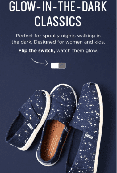
If you move the mouse over the slider, you see a picture of their glow-in-the-dark shoes. Hover over the live version here.
This example of an interactive newsletter is a fun way to show off your product and make it stand out. The only bad thing about these shoes is that they are only for women and kids. Toms, that’s not right.
Fab
Fab is an online store that sells things for women, men, the home, and tech. In this Newsletter, they take a more personal approach by putting on the guys who designed a popular line of watches.
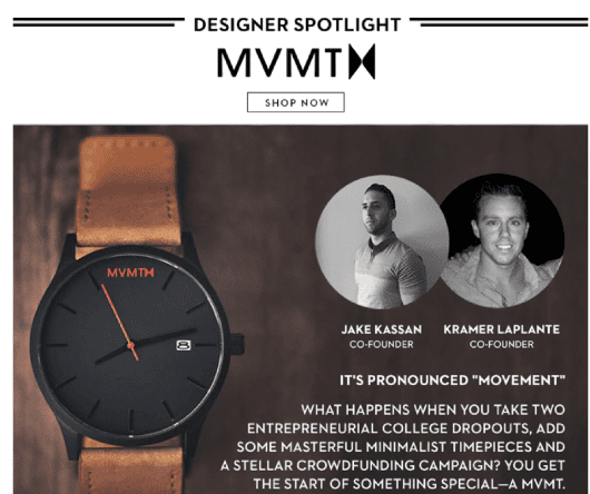
Fab is helping to build better relationships with its subscribers by putting a face to the products and making the shopping experience more personal (and, therefore, brand loyalty).
The email has a high-end feel and uses a neutral color scheme with good visual contrast. Beautiful and lifestyle photography shows how different product versions look in use.
Non-Ecommerce Newsletter Examples
Here are some great examples of newsletter designs from service-based businesses, software-as-a-service (SaaS) businesses, and those in between.
Take Action
Build your Ecommerce website with Shopify Today!
Shopify offers customizable themes, unique apps, and vital tools to start selling online. Try Shopify free for 14 days; no credit card is required.

Story Matters
Story Matters is a cool magazine that celebrates storytelling in all forms. Their monthly email delivers curated content such as articles, poems, and podcasts to subscribers. Each has a story or a discussion about storytelling.
The email in this example newsletter is clean and uses a simple and traditional format. Instead of images, the header makes artistic use of fonts.

The copy quotes key phrases and ideas from the article, which correspond to the clever “Waste not” CTA in the header.
The visual hierarchy guides one down the page to smaller content links, each with attention-catching photos and illustrations.
The copy in this publication is powerful, descriptive, and borderline poetic, indicating that it is all about storytelling.
Grammarly
Grammarly is one of the best tools for email marketing. It’s a writing app that can help you improve your messages and copy. As part of their email marketing, they send users a weekly update summarizing what they did with the app the previous week.
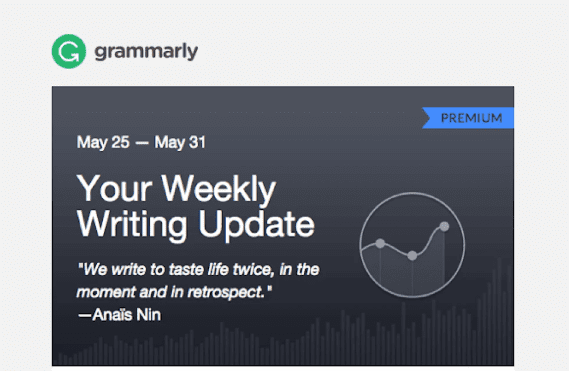
The update discusses how the user uses the app, how accurate they are, and how well their vocabulary compares to other app users. It lists the most common grammar mistakes and provides a weekly writing tip.
It’s one of the more traditional methods of creating a newsletter containing much information, but the Grammarly team does it well. They keep the copy brief and use colors to make it stand out and easy to read. Overall, regular users will benefit significantly from this email.
MailCharts
This non-ecommerce Newsletter makes for a great example of a short, sweet, and brilliant welcome message for a newsletter. MailCharts, a competing email monitoring tool, foregoes the frills in favor of a text-only welcome letter to new subscribers.
In the letter, assuming the marketing director position, you establish clear expectations by informing subscribers that they will receive a few emails each month. The best part is you ask them to hit “reply” and tell you about their biggest email marketing challenge, and you encourage them to ask you any questions. For example, the subject line, “How can I assist you with email marketing?” immediately demonstrates your concern for your readers.
This great way to build trust, humanize a brand, and get people involved. It’s also a smart way to gather valuable customer feedback that will help MailCharts improve its services in the future.
Typeform
Typeform, an online form and survey tool, understands how to capture a subscriber’s attention. For example, could you not open an email with the subject “Siri is dying”?
This email keeps things simple by containing only one call to action: visit their newest interactive article. In this article, they find Susan Bennett, the woman who accidentally gave Siri her voice.

The email newsletter template is simple and minimal. The blue soundwave GIF, inspired by technology, makes a simple but exciting header image. The copy has only a brief headline and subhead, a two-sentence blurb, and a green “Listen In” CTA button. The end. The best part is that’s all it takes.
1973 Ltd
A great way to market a newsletter is to keep subscribers up to date on what’s going on with the company. This is done well by the UK marketing firm 1973 Ltd, which uses its Newsletter to take readers behind the scenes of the company’s recent rebranding.
In this example newsletter, they also share three blog posts, a good number for adding more content updates without disrupting the Newsletter.

“We’re so excited to share this with you!” is a classic clickable subject line, albeit a little vague, in my opinion. The body header uses contrast (white text on a dark background). First name of the team member who wrote each article is included in the email as a personal touch to make the brand seem more likable.
Flywheel
A newsletter, as previously stated, is a great way to promote your company’s premium content. For example, flywheel, a company that manages WordPress hosting, sends an email encouraging people to download its free ebook.
This is one of the more “loud” newsletter header examples. When you open the email, you’re greeted by a large, bold image that immediately draws attention to the ebook’s cover.
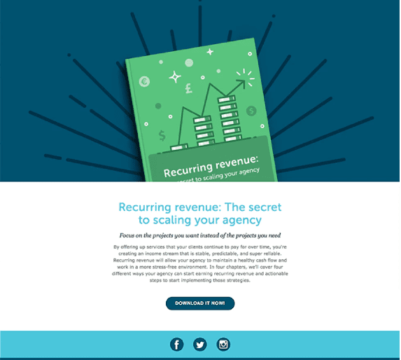
The larger headline is a bright blue color that draws attention to the ebook’s title. The smaller subhead is bold, & italicized in a serif font. The description is then written in a smaller, simpler font.
This excellent use of colors and fonts creates a visual hierarchy that shows the most critical information first and leads you to the “Download it now!” call to action. I also like that the ebook has four chapters, each with four tips. It’s an excellent way to let readers know what to expect.
Listrak
Listrak’s digital marketing automation platform has a good newsletter template for promoting the upcoming webinar to assist businesses in making more money on social media. In the header, you can find out what it is, what it is about when it is happening, and how to sign up.

The main graphic depicts a social media ad on a smartphone, keeping with the webinar’s focus on social media. Listrak cleverly uses boxes that look like social media posts, complete with likes and comments counts, to show the main problems that the webinar will solve. This newsletter format is very innovative.
Below the scroll are pictures of the two speakers. This allows readers to connect with the company and get to know the people they will learn from.
Wistia
Wistia Soapbox is a Google Chrome add-on that allows you to record and share videos. Wistia uses a video about the plugin in an email using Soapbox. Using the tool’s features to promote the tool is a good idea.
The video is a handy explainer that tells you everything you need to know about the extension in under a minute. The rest of the email is simple and to the point.

For example, the CTA slogan “Get on your Soapbox” is a fun play on the phrase “get off your soapbox.” Wistia, I understand what you’re saying.
Background photos and patterns can prove risky and distracting, but Wistia does an excellent job selecting a colorful design that doesn’t overpower the rest of the message.
Caviar
Food Delivery Service with Caviar Caviar understands how to keep its brand popular even as the seasons change. This newsletter example is about US Daylight Savings Time, which occurs in the spring and gives everyone an extra hour of daylight.
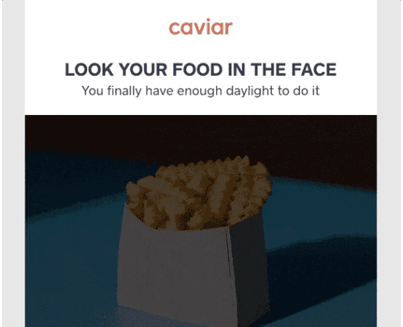
Even though food delivery has nothing to do with this twice-yearly event, Caviar celebrates that dinner time is no longer spent in the dark by offering free delivery. Instead, the clever headline, which includes a GIF of some fries wearing sunglasses, informs readers that they can now stare their food in the face.
Overall, it’s a fun, quirky example of newsletter content that reminds people of the brand and encourages them to order food, especially with that bright “Order now” button that still fits the brand.
Lyft
Lyft, a company that provides on-demand transportation, has a fun take on the traditional “Happy New Year” email. Typically, the company will use this time to reflect on how users have worked with them over the previous year. However, it informed the recipient of all Lyft users in their area this time.

They turned it into something akin to an awards show called the Lyfties. They displayed the city’s most popular bar, university, event venue, and restaurant.
Based on the topics, we can assume that Lyft is attempting to reach its target audience, young adults in their twenties.
This is helpful information. This is the type of information to click on & share from your social media news feed simply because it sounds exciting and fun. For example, Lyft has buttons to share on Facebook and Twitter to encourage people to do that.
Final Thoughts
And there you have it! You should now be good to start designing, building, and sending out great email marketing campaigns to help you reach your business objectives.
You can subscribe to the newsletters of some of your biggest competitors and favorite brands. Pay attention to changes and trends.
Try new things, but pay close attention to what happens.
To be a valid winner in email marketing, you must evolve and change at the same rate as consumerism. What works today might not work tomorrow.
That’s one of the best parts!
Did we miss any great ideas that you’ve found to be helpful? Share your thoughts in the comments.
Start Shopify For Only
Try Shopify free for 3 days, no credit card is required. By entering your email, you agree to receive marketing emails from Shopify.

Comments (0)