In this article, we explain how Shopify print-on-demand works, from setting up a…
How To Design A Print On Demand Store With Shopify
In this section of the free Shopify Print-On-Demand guide, we’ll discuss how to develop design ideas to create a Print on demand store with Shopify and create products, image mockups, and video mockups for your products.
Also covered are:
- Editing videos,
- Creating a store,
- Setting up the homepage,
- Product page, and so on.
Following that, we’ll discuss which software to use in the process and its features.
Canva
Use Canva for design. We will design our store’s social media posts, logos, banners, and T-logos. Canva has a free plan that is great for practicing, but I recommend Canva Pro for small businesses.
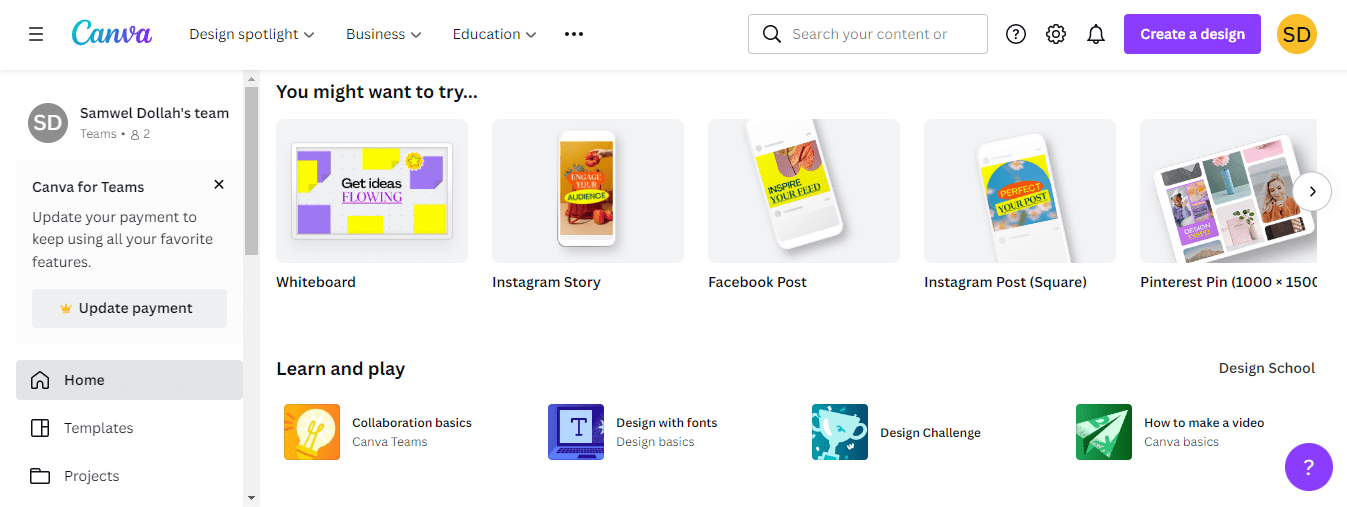
It has over 100 million premium stock photos, videos, audio, and graphics, 610k+ premium templates, a background remover, magic resize, and the ability to save your designs as templates for your team to use. In addition, you get 100 GB of cloud storage and the ability to schedule content for up to 8 social media platforms.
The PlanPlan costs $119.99 per year or $12.99 per month. I’ve been using Canva for years, and it’s always been simple and easy.
Placeit
Use Placeit to create an image and video mockups. You can find great images and videos of a wide range of products you can use in your designs. You can also use your designs on Placeit templates to create Facebook ads.
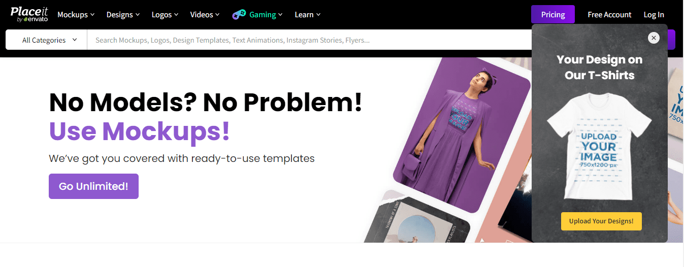
Placeit offers a free plan, but the designs it allows you to make are limited. So, if you have a small business, I suggest going with the limited PlanPlan, which costs $14.95 per month and $89.69 per year.
Invideo
Invideo can be used to edit videos. It’s a compelling piece of video editing software, with over 5,000 editable templates and over 8 million videos, images, and music tracks from iStock, Shutterstock, and Storyblocks. It also includes very powerful editing tools. In addition, you can trim, crop, transition, and add text and stickers.
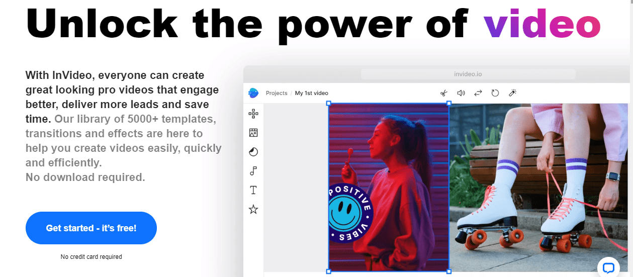
You can trim, fade in and out, loop, and customize a voiceover to audio files. You can make brand kits for multiple brands and use them with a single click. You can add team members to your Invideo account and use more than 40 fluid animations, which is fantastic.
On Invideo, there are three ways to create videos:
- Blank Canva
- Text to Video: All you need is a headline and some text, and the invideo will automatically match the footage.
- Use a template
Invideo allows you to practice for free, which is a great way to learn. If you want to do business with them, I recommend looking at their Business Plan. The business plan includes no watermarks, over a million premium media files, 60 HD video exports, 10 iStock media exports per month, and 20 background removers.
The annual PlanPlan costs half as much. So, for example, if the Business plan costs $15 per month ($180 per year), you only pay half of that.
Signing Up For Shopify Store
Go to Shopify and pick a store name.

If you don’t have a domain name yet, you don’t have to. Instead, you’d have to answer a few questions in the “Tell Us a Little About Yourself” section.
Are you already selling? Pick “I’m not selling products yet.”
Do you want to sell products through dropshipping? Say yes
You can choose directly the platforms you’d like to use for ads.
What is your current revenue? Zero
Which Industry will you be operating in? In this case, we are dealing fitness niche, so sports is the Industry.
Address Page
You will add your name, address, and any other information you wish to share on the following page.
Shopify Store
To begin configuring your account, navigate to the settings section of your Shopify store. The first will be your phone number, email address, and other general information.
For example, if you buy a domain from Shopify, you will receive forwarding emails. When it says “Shopify users,” it uses this to contact you, and you can add your email address.
You will include Shopify email forwarding for customers. The Plan is up next. I’d suggest starting with the Basic Plan. Then you pay the bills.
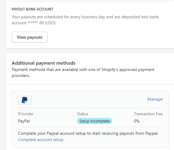
Make sure your PayPal account is a business account, and then set up Shopify payments or any other payment processors that work in your country.
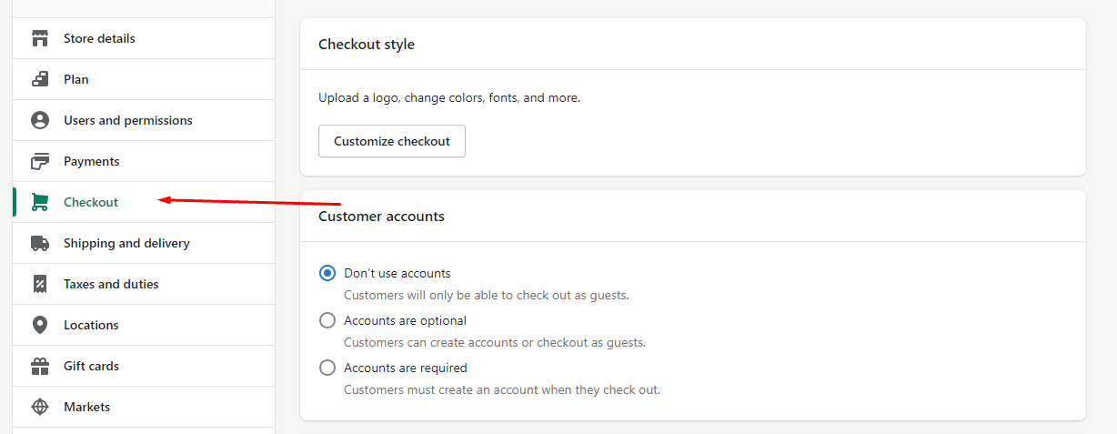
Checkout comes next. As accounts are optional, you can select “Do not use accounts.” Customers can also make you via email. Then, to receive shipping updates, select SMS and email.
Then comes information about the customer. You will need your first and last name. Make the company name optional. Address line 2 should also be optional, but the shipping address’s phone number should be required.
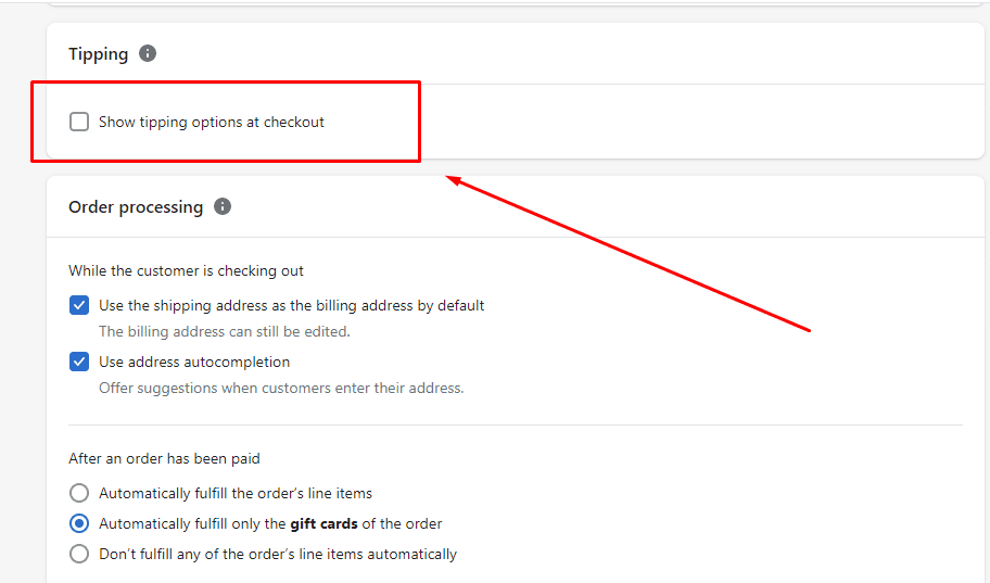
You can also configure tipping options, but you are not required to do so now. Leave as is for order processing. First, I suggest you do not automatically fill orders to gain more control over your business. Instead, fill orders by hand.
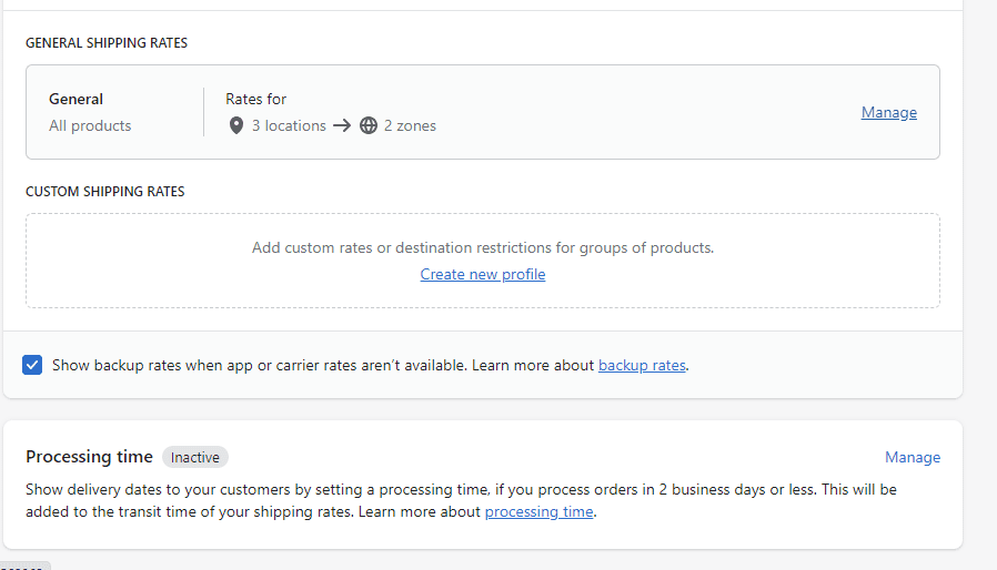
Choose SMS marketing if you agree to be marketed. Shipping zones and rates exist.

So, click “Manage,” and you’ll see all the presets. Because your fee will be built into the price of your products, I recommend that you scrap all the pre-made shipping rates and create your own. It is best to provide free shipping during the testing phase.
Next, tax. Create a tax collection system for your country or state.
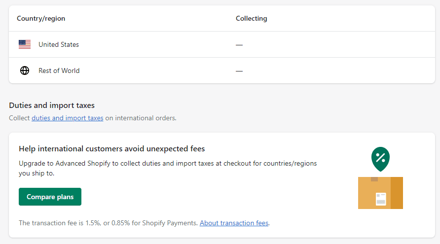
Domains that follow. Click “Buy New Domains” to look for available domain names. You will receive free business email forwarding when you buy domains from Shopify.

The following step is notification.
First, customize the email templates to your specifications. When you click “Customize,” you can change the color to match your brand, add your logo, and make any other changes you desire. Check your notification to see what information your store’s customers will receive.
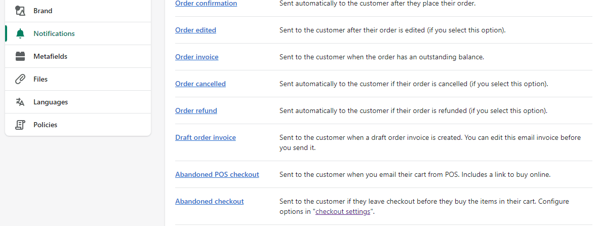
Following that is policy. You can choose where to set up policies in Shopify. For example, you can copy and paste your policies into the online store or create pages from the Shopify online store.
Online Store
You can find a free theme here at the online store, but we won’t be using it. Instead, visit the Shopify Theme store. Look for the Debutify theme. It currently costs free unless you want to upgrade to get more features, but you can use it as much as you want for free until you publish the theme.
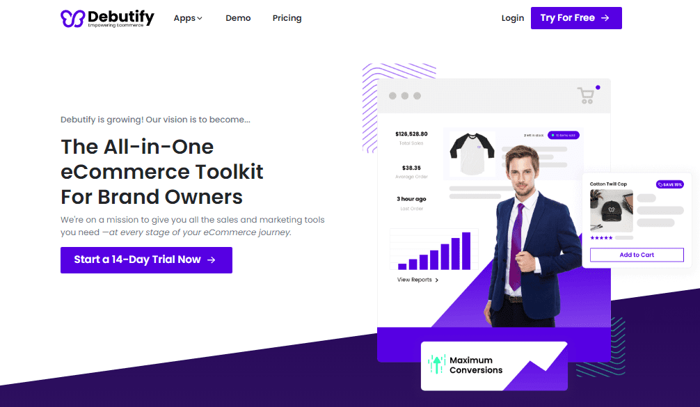
You can see how the store looks by clicking on “Demo.” The theme can be designed in three designs.
Click “Try For Free” to put the Debutify theme to the test in your store.
Homepage Preset
Before working on your homepage template, go to Canva and create a logo. Choose a logo template from Canva and then use one of the pre-made templates to get ideas.
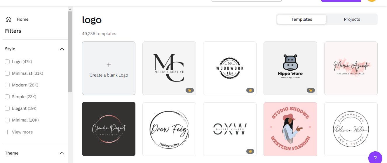
You can choose one, say, a Dumble, for our fitness store. Then change the background and element and replace the text with your store’s name (Fitness)
You also tell customers what you do and your value proposition, gym motivation clothing. Then look for dumbbells and try a few to see which works best.
Then, you change the fit of the element, place the text where you want it, copy it, and try it on another element to see which fits better.
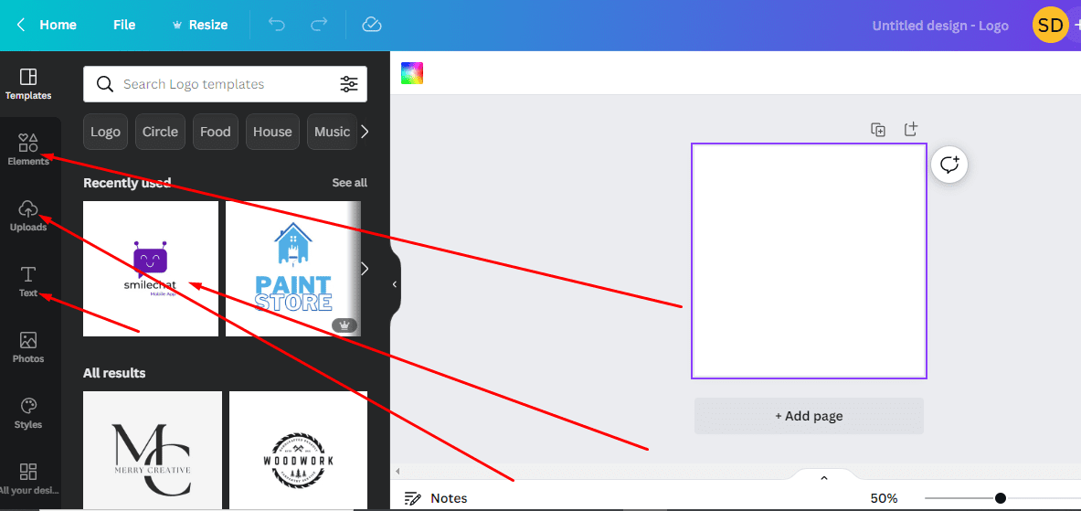
After changing all of the colors to black, click the download button. For social media accounts and other things, this is an optional option.
Copy and resize his file for the website. To resize and optimize this file for a website, change the height to 175, then copy and resize. Then, pick all the elements and group them to make your logo consistent with the first one.
If you want to download it with a transparent background, simply select the file, and you’re done.
Collection grids
You can now make a preset for your homepage. You can select the first section by clicking on the section which will be the video banner (video hero banner). The grid after that will be “featured collection” or “bestselling collection.”
Next, create the animated hero banner and the banner for one of the collections, which will most likely be tank tops. The images on this banner can be removed in two ways; there are two sections for the images so you can take one out.
The grid of featured collections follows. You show products from the collection displayed on the banner here. Also, change the section. Finally, you will see four products on your desktop if you make one row of products instead of three.
So far, you have a video banner, and we have a featured collection and a collection of our best-selling items. For example, a tank top collection shows the most popular ones.
In the following section, you add another banner and repeat the collection process. Following that is a section for social media, a box to sign up for a newsletter, and a footer menu. This is your homepage preset, and the bestsellers collection will require four images and a desktop-optimized banner. If you click on the image, you’ll see that the banner can be optimized for desktop and mobile viewing.
Create a horizontal and vertical banner for each section at this point. Next, put together a collection of tank tops and display the best-selling ones here. Do the same for the t-shirt section.
Finally, you create two banners, one for desktop and one for mobile. This gives you four more t-shirt images; the last banner is for hoodies.
The same applies to hoodies. You will create five Instagram posts for your homepage and optimize the menu at the bottom.
You can make a plan now that you have a Shopify account, have chosen a theme, and have set your homepage. And because you are doing POD, which means you are creating products, designs, product materials, and pretty much everything else for a store that sells multiple items, you need to have a plan and make sure you know what you are doing.
Pre-Building Checklist
Let’s start with the list of things to do before building.
- Brand colors: Use black, white, and a touch of yellow, for example.
- Logo & Design: Create logos and designs using www.canva.com. You create one logo in black and white, then 10 to 15 designs (not different color combinations, just different designs to work with), and a favicon.
- Policies: When you create something in Shopify, you can add Shipping, Return, Privacy, and Terms of Service.
- Pages: You can make new pages in Shopify. You may not need an “About Us” page yet, but you can make a good FAQ. You’ll also have a separate “Contact Page” on the “Product Page.”
- Product Content: Use Placeit to create mockups and videos. Printful can help you find the “Product Description” and the “Size Chart.” Create products at Printful, change the description, and include a size chart on your product page. Also, make five social posts using Placeit and Canva. Use Invideo for video editing and Placeit for mockups, but look to Pinterest for inspiration.
Next, depending on how our homepage is set, you will require four collections: bestsellers, tank tops, t-shirts, and Hoodies. As a result, you’ll create mockups of the collection pages.
At this point, you’ll be able to show four products from each collection on the homepage, so you’ll need four images for each collection.
I’ll also need image banners in two sizes, one for desktop and one for mobile. You won’t need an image banner for the bestsellers collection because a video banner will appear above the bestsellers. Instead, make one for desktops and one for mobile tank tops. Do the same with t-shirts and hoodies.
Make one video banner, five Instagram posts, and 15 product designs. When I say “product designs,” I’m referring to mockups for collections. So it’s useful to have a few extra things to compare and select the best from. You’re ready to go.
How To Get Inspiration From Pinterest
What you do is search for popular designs in your chosen niche. For example, assume we’ve decided on Fitness as our niche for the time being. Then you mark ideas as “My Favorite,” and when your list is good, you should be ready to begin designing.
If you don’t already have an account, create one now.
We’re now looking for ideas. Look at popular t-shirts on Pinterest to get ideas. Search for workout t-shirts with sayings on them and save the ones that get a lot of positive feedback. Put them on your “Favorites” list.
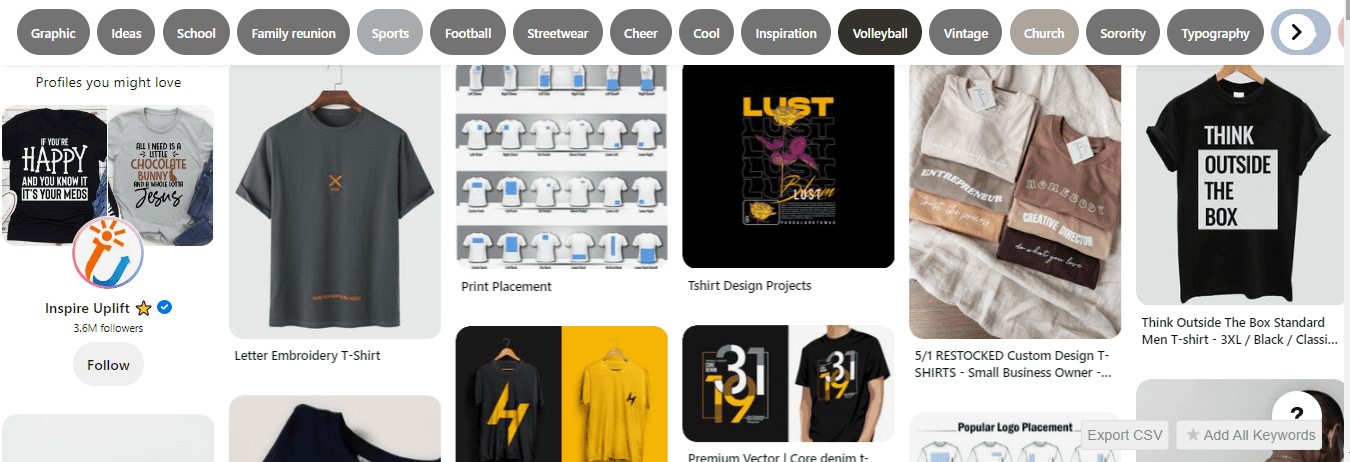
If something you like or want to see has a lot of reviews, save them to use as inspiration. So the goal here is to find workout t-shirts with sayings or funny gym keywords so you can get more ideas for fun t-shirts.
Gather all of your Favorites ideas. Take a screenshot of each inspiration to get designs, making it easier to start working on your designs. For example, take a screenshot of the screen and use Powerpoint to put all the pictures.
In this case, we can first say, “Don’t give up.” “I’m Not Drunk, Today Was Leg Day” comes next. Save it. “Be a Beast” is up next. You might like how certain colors look together, which could inspire you.
For example, “Think Out Of The Boss” could be a fun phrase for a t-shirt. “Don’t forget to stretch,” came next. There’s also “I’m in shape; round is a shape,” which I believe is sufficient to get you started.
The Designing Process
Let’s get started with the design. “Don’t Quit” First, change the font for both, then the colors. You must change the text size to “250.” Duplicate and create color combinations that oppose each other, such as white and yellow instead of black and yellow.
Next, “I’m Not Drunk, Today Was Leg Day”
Choose a template and copy the text “I’m Not Drunk, Today Was Leg Day.” Then resize the text and look for elements (legs) and something amusing to place in the appropriate place. Use colors that don’t go together, such as white text on a black background.
Canva also provides the option to view a preview, which is very useful. You can use the preview to double-check all of your designs before printing and see how they will look on t-shirts. The color of the t-shirts can also be changed. Preview lets you see how your designs look on the front and back.
Preview is a handy feature because it saves you time while designing.
Next, “Badass With A Good Ass” Google Eyes can be combined with other elements. Text in black on a white background, duplicate it to create the opposite color combination, and so on. Selecting all of the text can change the color to white. Then, to change the text easier to read, change the background color to black and the element color to white.
Next, “Stretching Like A Cat.” Search for “stretching cat” and select a few variations. Choose one and get to work. You have the option of changing the font.
You can choose not to have all of the text at the top, so “Stretching” can be at the top and “Like a Cat” can be at the bottom. You can change the size of the text and its color to white before duplicating it to create opposite colors.
You can use the circle as the cat’s background if the text is white and the element isn’t changing color. For example, one is for a white t-shirt, and the other is for a black one.
You can use the skate template, remove the word “skate,” replace it with the word “run,” and replace the skateboard with a graphic. Then, go to “Run” and search for pictures. Then, you place “Run” over the white lines, and then you can download.
You can now create a few more designs. Another thought is to “keep it simple.” Then, change the color to “white” and the text color to “white” by going to “elements” and searching for “sneakers.”
This should be for a “black t-shirt.” Instead, you’ll need to select another option for a new design, such as changing the text color to black.
Then you can do “Better Me,” which is a great workout motivator. For example, you can change the graphic to something workout-related, change the color to white, change “Let’s Rock” with “Let’s Workout,” and use it on a black t-shirt with this.
Barbel comes next. You can select “Wild Sale,” remove the extra text, and replace “Sale” with “Power,” leading to “Wild Power.”
Now we need to go to Placeit and head the banner model. I recommend you choose a niche and review the materials on Placeit so you can keep all of your options in one folder. It will be beneficial to pick your options and choose one.
It’s best if you can compare comparisons. Another thing to consider is the shape of your banner. Banners can be horizontal or vertical; if a section requires a vertical image, you must use a vertical image rather than a horizontal one because using a horizontal image will crop your images.
So you’ll need to know what shapes you’ll need for your mockups. You could try a couple of images. First, you upload with your device.
So now we have a couple with images and a “Don’t Quit” design. You can make the woman’s shirt black and the man’s shirt white by uploading and downloading a new image.
Then you can make a hoodie. Choose a “Keep It Simple” design in white, crop it, and change the hoodie’s color to black. The image should be ready for download now.
If you find a t-shirt mockup, you can remove the image of the pants to plain colors, upload the image for the t-shirt, crop and resize it, and the image should be ready to download.
Make a new T-shirt for the banner this time. Upload the image, change the color of the T-shirt to yellow, and the image should be ready to download.
You can repeat this process for different designs. When you’re finished creating images, don’t forget to resize them. You can resize files using a tiny PNG. This is important because large images will slow down your website.
Creating Promo Video
Now we’ll create a video ad for your homepage’s video banner. Go to “My Favorites.” You already have some of the materials you’ll need for this project, and you know roughly where the videos you want to use are.
The videos have a white background, and more than one person must design the promo videos. Make it black, sing “Better Me,” and play all slides. This means you can watch the video and process it. You can try and download “Wild Power” by clicking on the “Download” button.
Then go to Invideo and create some blank videos to use as backgrounds for your videos. Then, you must be prepared with the frame. Then you add your videos, but first, check it’s ready.
Then, begin uploading files and videos. Then, they will be in the middle of the video. Then, make the video square large enough to fit within the video frame. Then, add your videos and put them all in the same location. Finally, put all of the slides in this folder.
Then put the slides and add two more videos to the sides. It’s now ready to be downloaded, but make sure you don’t have any music playing because this one doesn’t require it. So click the “download” button.
Now that the video is ready, I believe you should make a YouTube video and upload it to your account. So you click “Create,” then “Upload video,” and then select a file from “Downloads.” This is our final option. You must first unlist it before you can publish it.
Social Media Posts
You have to create five social media posts that will display on the homepage. Then, head over to Placeit to create these posts, and then use Canva to customize how they look. Start with the t-shirts. You can have two tank tops and two t-shirts. Make one for every woman and one for every man.
Choose “Keep It Simple” from the “Mockup” drop-down menu for the first image. Then, click “Download” and go to Canva. Choose an Instagram post template at Canva and choose the mockup you downloaded from Placeit. Set the image as the background after you choose it.
Download it next. Choose a different image and change the color to what you like. Choose the designs for hoodies for couples. When you’re done editing images on Placeit for other designs, go to Canva to optimize them for Instagram posts, just like you did with the t-shirts.
Again, put the image where you want it, set it as the background, place it where you want it, and you’re good to go. Do this for each upload you make to Placeit, then download them all.
Go to Shopify, click “Online Store,” and then hit pages. Then, click “Add Page” in the top right corner. The Shipping Policy will be on the first page. Then, copy your shipping policy and paste it into the content. Save, and the page is ready.
On the next page, under “Return Policy,” paste the content again and click “Save.” On the next page, under “Terms of Service,” copy and paste the content of your terms of service, then click “Save.” Next FAQ page. Paste your FAQ content and save. Next, paste “Privacy Policy” and click “Save Content.”
Navigation
Now, go to Navigation.
You have a “Footer” and a “Main” menu here. You can leave the “main menu” as it is, but add the pages you just created to the “footer menu.” You don’t have to add the name here. Instead, click on the link, and the name will appear.
First, choose Shipping policy, click “Add,” and we’ll move on. Next, add the Return Policy, Terms of Service, Privacy Policy, “Contact Us,” and the FAQ page.
Products
If you go to products, we create the collections here. So, click “Create Collections” in the upper top point. The first collections will be best-bestsellers, and you can now do automated assignments. Choose the product tag, choose “is equal to,” copy the title, paste it in “condition,” and save it.
Create another collection of T-shirts with the same name, copy the title, paste it into the “Condition” field, and then save. Next collection, tank tops; repeating the same, copy the title, paste in conditions, and save. Next, hoodies, copy and paste the title into the conditions. That makes four collections: T-shirts, tank tops, hoodies, and best-bestsellers. The collections are ready.
The Shopify App Store
We go to the Shopify app store and get the Printful, Print On Demand app. We click on it and install it in your store. You can create an account here if you don’t already have one. Now that your start is connected, you are ready to add products.
Create a couple of simple products. To do this on Printful, choose two tank tops you will create. Pick “Im Not Drunk; Today Was Leg Day” Go to the men’s clothing section and choose tank tops. Then, choose tank tops that match the ones you made mockups for and start making designs.
Choose white here if your mockup is, say, white, and then start designing. First, click “File,” “Upload New File,” and type “I’m Not Drunk, Today Was Leg Day.” Then, open the image and click “Apply.” Check the quality of the printing, and then match the tank tops.
The next step is to work on the inside label. You can customize how the label looks. Click “Choose File” and upload a new file. Now you have a print on the front and a label inside. Now you can go to media to proceed with what kind of media you want to use.
Pick a style to use, then proceed on to the details. Next, change the product title to “Leg Day Tank.” Read over and change the product descriptions. Then, add a size guide so that a size chart can be attached and Imperial can be used. You can use metric and imperial if necessary, and both will be shown.
You’ve created collections at this point, and this tank top will display up in both the tank tops and the bestsellers collections. Add the tag to the collections, and this product will go to both of them when exported.
Product Pricing
You can proceed on to the prices. To make the price more realistic, you can make general changes and sell this tank top for $29.99. So, $14.04 will be made. Put it in the store. Then, create another product before you publish. Finally, you create products for “Badass Good Ass” and other designs for mockups.
Now we can go to Shopify to check more changes before we’re done making products. We can also make more products and head over to see what the homepage looks like.
You will add a mockup where you created a product and have the image as the first image. You save the product with sizes and prices that are all customized and good. Repeat this process for the other products you’ve created; you should be ready to publish.
Customizing Homepage
You can now start making changes to the homepage. The video banner comes first. Copy the link to your YouTube channel and paste it here. Check out the mobile view as well. The height on the desktop is 650 pixels, and the height on mobile is 500 pixels. If you make changes, for example, you’ll be able to watch the video in full-screen mode, but there will be two black lines at the top and bottom, which you don’t want. So 500 pixels is the best match for the video.
The next section is about bestseller collections. Choose the collection from Shopify, where you’ve already made collections, and we’ve made products for them. For example, the banner for tank tops is a bestseller collection.
Get rid of all the text and just leave the “Shop Tank Tops” button. This button will take customers to the page with all the tank tops. So, pick “Collections,” then “Tank Tops.” Add pictures, and since we created two banners for the tank tops, one for desktop and one for mobile, you can choose which one to use. Save, then proceed on.
Next, you can check out the section on trendy tank tops. Two spaces separate each mobile product in a row. You can also try a different color for this section. In the first section, you can show products on a white background, and in the second, you can put them on a dark background. Fore, You can use “Enable Quick Shop” to look for trendy tank tops.
T-shirts are the next section. Do the same thing and add an image for the T-shirts. Use different images for desktop and mobile. T-shirts, choose from the collection. For “Button,” place it bottom left. The first one has a button in the middle.
Read Also:
- 6 Types Of Ecommerce Business Models To Start On Shopify
- How To Choose Your Ecommerce Business Model In 2022
- What Is ePacket Delivery? Everything You Need To Know (2022)
- How To Run Facebook Ad For Shopify Store – PPE & WC (2022)
- Teelaunch Print On Demand Review: About The Features (2022)
Hoodies make the last banner.
Choose hoodies from the collections. Put a button in the bottom right. Choose an image for hoodies-image on both mobile and desktop. You can use different colors for the hoodies and the last section, “social.”
Click “Social” and add posts to social media. Add five posts and then add images. “September Giveaway” can be the first image. You can add the link to the social post, select the product, and add the number of likes. Then, move to the next and make it “Join Lucky List” So, just add the account name, and social is also ready.
The next menu item in the footer will be the Subscription Section. Go to the footer menu, select the footer menu, and then choose the menu we made at Shopify. It’s already set up, and all the pages will be attached here.
Next, click on “Theme store” settings, and add the social media account links for every social media account you manage. Then, ensure it only accounts you host, manage, and use. So, if you turn them off, the copyright will be gone for payment icons and copyrights, but at this point, you can add, if your company name is different from your store name, this structure: store name/managed by your company name.
And you can add a disclaimer saying that this store is not part of any social media platform and is run by your company (name)
Customize Product Page
Now we can customize how the product page looks. First, ensure that reviews review star ratings are shown next to the product name when you install apps for reviews. First, check how the page looks. The first part is the product. So the price is done, and you can keep the variant picker as a button instead of a drop-down menu. Color swatches can be shown if you turn them on.
Choose the amount. The section has no way to change it—next, a box for shipping. Here, add one more box that looks the same as the shipping box under it. Then customize it your own. Finally, check the box and say, “30-day money-back guarantee.” Save the information and move on to the next step.
Leave the inventory as it is. For example, “Show Dynamic Checkout Buttons” next to the “Buy” button. Size Charts are different for this case because various designs and products are from different manufacturers. So you might not want to keep the size chart right now because if you do, you’ll be able to add a page for the size chart. You’ve already imported the Size Chart from Printify, and you can choose this option in the “Description” field.
Customized “Description” You can take out any extra text you don’t want customers to see—details about shipping. Then, move past the short information about shipping. At this point, I suggest you have your customized shipping information based on the company.
You’ll find more information about shipping if you click on the page’s shipping policy.
The last box is a “Contact Us” section. You can leave it alone. Then we have “Share on Social Media” and “You May Also Like,” and the products will change constantly. You’ll also have the Footer Menu and the Subscription Box. Finally, the product page is done and dusted.
Catalog
This button is also on the page for the product. You also want to customize the Catalog. Add more sections here, and that is a collection list. Bring the collection list up. The collection list is shown first when a customer goes to the collection catalog. Then, all the products are shown, and the customer can search by price, etc.
Here, you can choose by collection, so click on “collection,” then “bestsellers,” “t-shirts,” “tank tops,” and “hoodies,” and then click “save.” Check for the mobile view.
Cart Page
Proceed on to the Cart page. There are featured collections on the cart page; you pick the collection you think will be the best-bestsellers. You also have to customize how the Checkout works. Choose the logo, resize it, and you’re done with the cart page.
We’ve designed the store, but before proceeding, I’d like to ask you to check all the buttons, pages, links, apps, and test orders before you publish your store. Then you’ll be ready to publish your store and start marketing.
In summary, your homepage starts with a video banner that shows best-selling collections, then banners for tank tops, and finally, banners for trending tank tops. Then there are t-shirts, especially the most popular ones. Next is Hoodies, and we show collections of our favorite hoodies. Then we have social media, Newsletter Subscription, and the footer menu.
On the Products page, we have our guarantees, a description with a size chart, information about shipping, and a box for frequently asked questions. Also, “You May Also Like,” Footer Menu, and Newsletter Subscription.
The Catalog shows all the collections at the top, displayed by all the products. At this point, you’ve made separate collections for men and women, which is why all the items are shown here.
Page of the shopping cart. You have popular choices for products, signing up for a newsletter, and the menu at the bottom of the page. For the Checkout, there is a mobile view with the Bestseller collection, different banners for tank tops, trending tank tops, and different banners for different t-shirt collections. There are also different banners for hoodies, showing Favorite hoodie collections.
We have social media, newsletter signup, and a menu in the footer. Then you have a mobile view of your Catalog, product page, cart page, and checkout page.
Start Shopify For Only
Try Shopify free for 3 days, no credit card is required. By entering your email, you agree to receive marketing emails from Shopify.

[…] Search for the product on Aliexpress or start a print-on-demand […]