If you’re operating a Shopify store, you’ve certainly encountered a chargeback; if…
What Is A Product Page ( Product Page Design Examples)
Have you ever asked yourself What Is A Product Page? and some of the best product page design examples to withdraw inspiration from in 2022? Don’t worry you are on the right page.
Consider the most recent item you acquired digitally and shop online.
What initially led you to make the purchase? What aspects of that website and product made it more enticing than the dozens of other options you almost surely had?
We’re prepared to bet that the product page determined a substantial chunk of your decision.
This is because it is most likely the page that influences how many of your visitors convert.
In some ways, product pages resemble salespeople in a retail store. They allow you to make an intriguing case for your product and address any customer’s questions.
It would be foolish to create a traditional store without first developing great product pages; similarly, there is no need to take the risk of opening an online store without first setting quality product pages.
Furthermore, once you begin running adverts on Google or social networking sites like Facebook and Instagram, you will be able to direct traffic directly to the product page that corresponds to each product.
As a result, you won’t be able to rely on the brand-building that your other pages supply.
What is A Product Page?
The question now is, what constitutes a “good” product page?
It ought to fulfill several requirements, such as the following:
- Providing consumers with a realistic, vivid, and accurate image of the product
- Illustrating (rather than simply stating) how the product can make the customer’s life easier and more enjoyable.
- Creating a sense of confidence using various methods, such as delivering trustworthy information, keeping an attractive appearance, and soliciting social feedback from clients.
- Keeping its word while remaining simple and user-friendly in all aspects of its operation
There are many methods to meet these basic requirements; nevertheless, the keys are in the overall format of your product page and features like product descriptions, images, and videos.
This blog post will examine these components, give you best practices and guidance for your store, and show you numerous instances of businesses that are successfully using these components.
Shall we?

Types of product pages
Before we get into the specifics of what a product page looks like, there are two product pages: the product landing page, often known as an ecommerce landing page, and the product listing page.
Product detail page
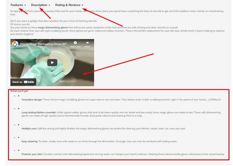
The product landing page, also known as the product information page, will be the primary focus of this post. It is used to display a specific item from your store’s inventory. In addition, it gives the site visitors all of the information they need to make a purchasing decision.
At the very least, the landing page for your product should include:
- A compelling description.
- High-quality images and a video.
- An easy path to the purchase button.
Inspireuplift’s product landing pages are aesthetically beautiful, well-designed, and crammed with important product information.

Each product and color variation is complemented on the website with a video demonstration of a model wearing the shoes and numerous up-close photos taken from various positions.

The descriptions above the fold are brief; however, Inspireuplift gives a wealth of additional information in the following sections.
It displays the company’s Instagram feed, a description of the materials used, a graphic describing the anatomy of each shoe, several essential characteristics, and customer reviews.
Product listing page
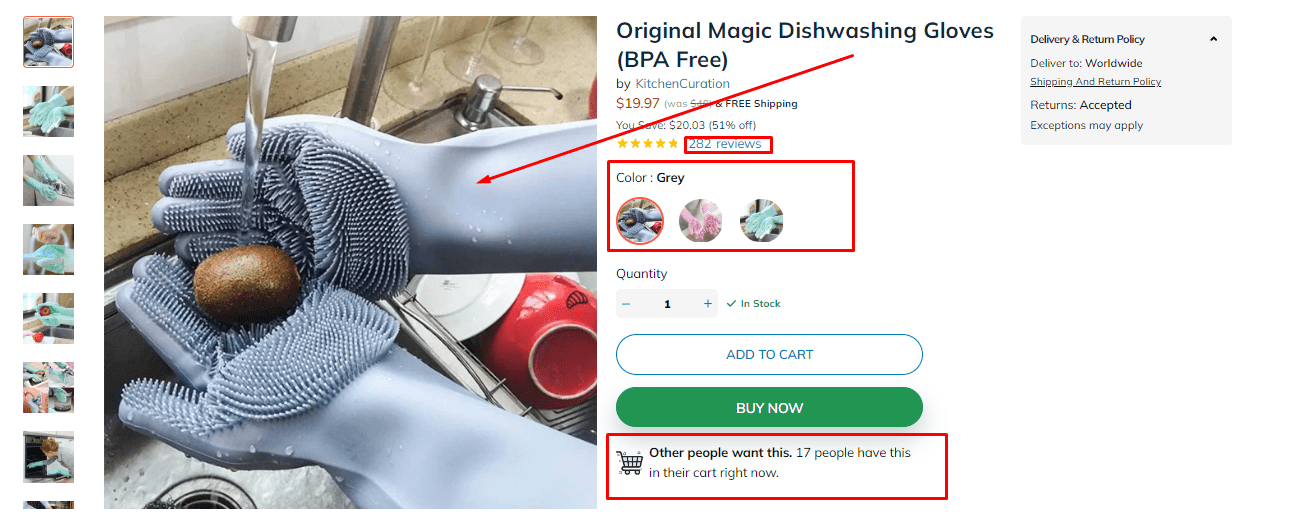
A product listing page also called a collection page, are several products in one place. It should have a thumbnail image of each product and the product name and price.

Other details, such as a star rating, availability, or item variations, could also be added.
In most circumstances, a product listing page will display a complete list of a store’s available goods or listings organized by category.
Inspireuplift is an e-commerce store. Each of the store’s key navigation categories has its product listing page.
The website displays a thumbnail image of each product, its name, its price (including both the usual and discount prices, if applicable), and a sequence of colored small circles that site users can hover their mouse over to view photographs of an item’s many color options.
Having a page that lists all of your products is relatively standard practice, and we strongly advise you to implement it on your online store.
It allows your site visitors to browse your items and get a sense of your inventory.
Nobody has time to look through each product page when they haven’t chosen whether or not to buy anything.
Product page Anatomy
A good product page meets all eight of the following requirements:
- Details about the product include its name, price, and the many options for modification or variation (like colors and sizes).
- A product description focuses on its features and how they satisfy the visitor’s goals, needs, or worries.
- A high-quality “featured image” of the product and a big shot of the product.
- Additional images that the visitor can browse through to get a better idea of the product’s size, texture, and application.
- A prominent and gleaming call-to-action (CTA) button invites customers to add the product to their shopping basket or pay immediately.
- A user-friendly and simple-to-navigate arrangement in which product photos are often displayed on the left side of the screen, while product details and the “Buy” button are displayed on the right.
- Instilling trust in your company and its products through social proof, such as Shopify product reviews, product testimonials, or trust badges.
- Recommendations for complementary products in a product to improve the visitor’s total order price.
Now would be an excellent chance to show these into practice by going through an anatomy course.

We will examine a product page for the Inspireuplift company.
Product name
The product name, “Christmas 3D Rolling Pin,” is printed in a font that is unique to the company and is written in a large, easy-to-read font. A brief remark named “Reindeer & Christmas Trees” appears just beneath the image, alerting the visitor of what it is and why they should use it.

Social proof
Visitors to a website can read reviews submitted by social purchasers to acquire insight into the amount of satisfaction with a product.
Customer testimonials are a great technique for encouraging prospective purchasers to buy a product. When customers click on this area, they will be led to the bottom of the page, where they may browse all of the reviews for Shopify products.

You may easily execute this task on your e-commerce site using the Shopify apps Testimonials + Product Reviews, Comments, Ratings + Reviews, and Loox Photo Reviews.
Product Description
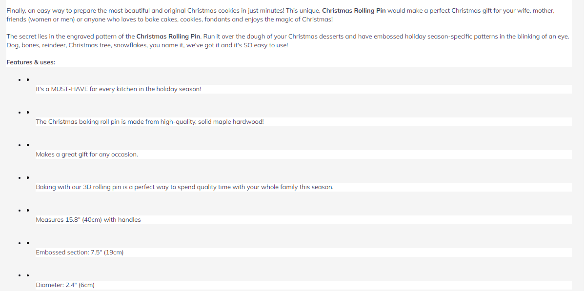
The product description uses colorful and descriptive language to paint a picture for customers of what the product can do for them.
This Christmas 3D Rolling Pin is said to provide you with “instant moisture 3D-engraved cookies” and is “extremely accurate.”
Inspireuplift also includes valuable information, such as the fact that it is easy to use- and very light-tested, designed for unique cookies.
There is no doubt that the target audience for this product is someone who loves cookies, and there is also no doubt that this product can help that person enjoy making cookies even more with the unique designs this tool is engraved with.
Price, Quantity, and a Buy Button.
The price is displayed clearly. The quantity selector has been positioned directly below so that site users can choose the exact number of items they want. Then, click the “BUY NOW” option. Finally, it is colored green to stand out from the other items on the page.
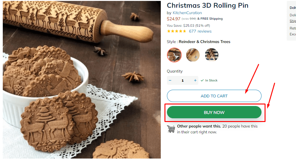
In addition to its prominent visibility, the color green is associated with good and cheerful states of mind, such as happiness and optimism, according to color psychology.
Featured Image
The jar is prominently displayed on this product page. Additional product photographs allow the user to see what the texture looks like both inside and outside the jar and on someone’s face.
Customers want to know what to expect from a cosmetic product, especially if they intend to apply it all over their skin; therefore, providing this information is essential for a product in this category.
Supporting Images And Video
When you browse “besides the fold,” you’ll find more photos of the product in action and a tiny 10-second product video popup embedded on the product page.
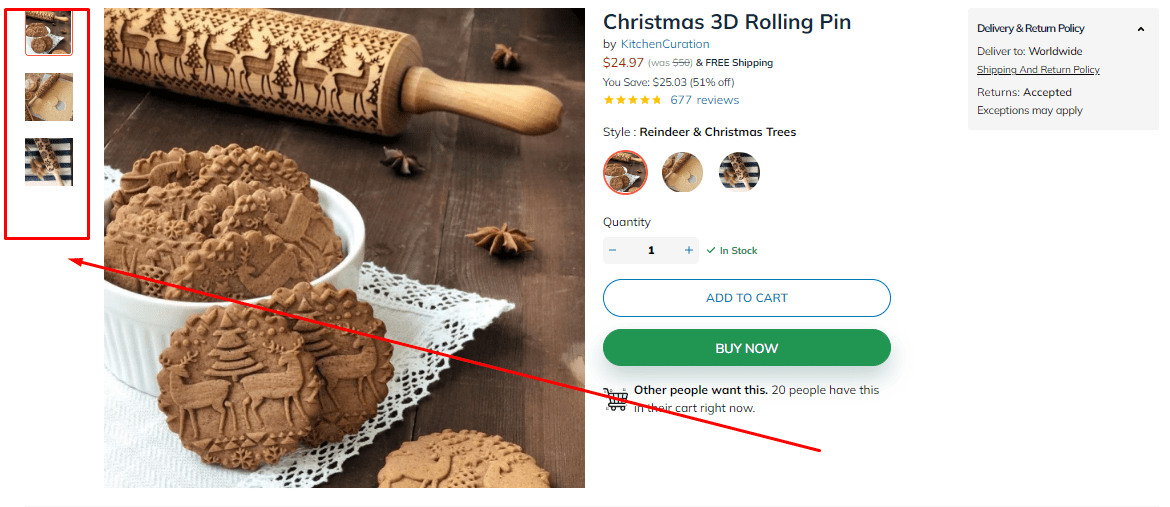
Product films do not need to be high-budget movies to serve their purpose and boost the atmosphere of your company. Instead, what you’re looking at is a composite of many pictures that have been blended.
Additional Product Details
Following that, you will find additional information on the product, such as how to use it, the components that make it up, what makes it unique, and every detail a customer needs about the product.

This section will serve as a welcoming light for visitors interested in the relevant issues since they loathe these by-products and want to avoid them.
Product Recommendations
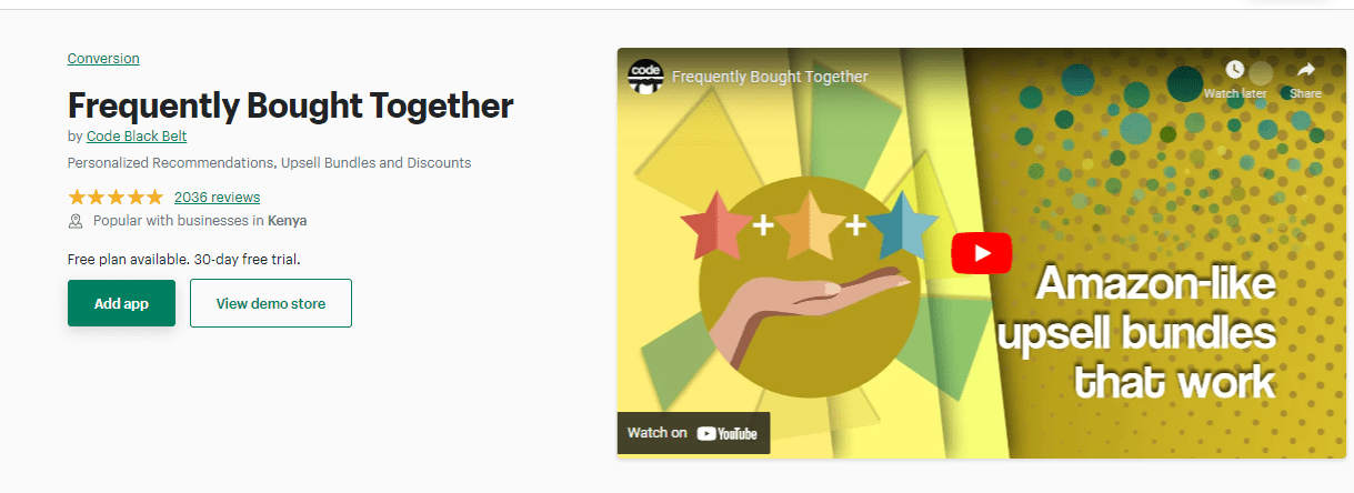
The “Frequently bought together” section offers a fantastic opportunity for product cross-selling. In this circumstance, you should attempt to increase your “average order value,” also known as the “average dollar value for each customer’s order.”

One of the quickest ways to increase average order value is to suggest related products currently hot sellers. For example, consider some of Shopify’s product page cross-selling applications, such as Frequently Bought Together.
Customer Reviews
You can read the customer reviews teased under the product’s name at the top of the page by scrolling down to the same section of the page.
Furthermore, Inspireuplift allows reviewers to personalize their experience by providing information about their experience with the products they bought.

This gives site users some additional information to decide whether or not the product review is related and relevant to their qualities and way of life, which helps alleviate one of the major challenges associated with beauty product reviews.
Extra Credit Pointers
In addition to the strategies discussed thus far, a few other product page strategies can assist you in increasing customer loyalty and sales.
Develop A Sense Of Acute Urgency Or Scarcity.
Setting a time or quantity limit, on the other hand, increases impulsive purchases. For example, you may improve the effectiveness of your Shopify product page by encouraging customers to purchase without giving them time to think about it by employing urgency and scarcity strategies.
This can be performed in various ways, emphasizing items that are currently sold out or unavailable in the desired size. This is a successful method in the fashion niche. You can also launch flash sales and other limited-time specials.
When you’re on a product page, the following Shopify apps can help you:
Include An Easy Way For Customers To Message Or Chat With Customer Service.
Customer service is critical. Displaying a chat option on every page of your website is an excellent way to increase your credibility and the degree to which people view your trustworthiness as trustworthy.
You can provide the option to be messaged directly and through Facebook Messenger, Twitter, or Instagram. It shows whether or not any customer care agents are now available to chat.
Read Also:
- How To Engage People With Email Marketing For Shopify (2022)
- How To Grow Dropshipping With Social Media Marketing (2022)
- How To Create A Memorable Dropshipping Brand In 2022
- How To Choose Products And Suppliers For Dropshipping (2022)
- How To Select Niche Markets For Dropshipping Store In (2022)
Use Colour Psychology To Captivate Your Target Audience.
Color psychology studies how different colors and tones can elicit various reactions from people. We suggest utilizing color psychology not only on product sites but also in the branding of your entire organization.
The following is a list of important colors, explaining what color psychology says about the emotions that particular colors may elicit.
Color: Red
What it Communicates: It conveys a sense of elation, energy, passion, and danger.
Color: Pink
What it Communicates: Femininity, playfulness, and unconditional love are all messages it transmits.
Color: Orange
What it Communicates: It conveys creativity, enthusiasm, adventure, and a sense of balance.
Color: Yellow
What it Communicates: Joy, enthusiasm, optimism, and a pleasant sensation.
Color: Green
What it Communicates: Health, expansion, fertility, and giving.
Color: Blue
What it Communicates: tranquillity, peace, stability, and trust.
Color: Purple
What it Communicates: It conveys power, opulence, wisdom, and nobility.
Color: White
What it Communicates: innocence, tidiness, humility, and benevolence.
Color: Black
What it Communicates: A sense of power, elegance, and sophistication.
It would help if you considered the individual preferences of those who will read your work. For example, one study examining the association between gender and color discovered that men like shaded colors color with black added to them. In contrast, women prefer tinted colors (colors with white added).
According to the researchers’ findings, color schemes with tints give off a youthful, relaxing, and carefree attitude, while color schemes with shades give off an authoritative, secretive, and profound vibe.
Of course, there will always be exceptions and outliers based on your organization and audience; none of these assumptions will be correct 100% of the time.
However, color psychology guidelines can aid in the creation of harmony between your brand, products, and audience, so giving it some attention is a smart idea.
You now understand what a product page is, which components contribute to the page’s overall efficacy, and which Shopify apps for product pages may be helpful to you in your store.
In the second volume of this series, we’ll go deeper into the subject and explain how to write fantastic product descriptions for your product pages.
Start Shopify For Only
Try Shopify free for 3 days, no credit card is required. By entering your email, you agree to receive marketing emails from Shopify.


Comments (0)